
The market can look wild on the surface, but its charts quietly reveal what’s really happening beneath the noise. That’s exactly what stock market graph analysis helps to uncover: How prices move, where they react, and what the market is hinting at.
A stock market graph is simply a visual record of price and volume. It shows trend direction, key levels, and changing momentum, which helps the traders to understand behaviour that news alone can’t explain. That’s why learning to read these graphs is essential for making smarter and confident trading or investing decisions.
Keep reading to know more about stock market graph analysis, the chart types, their components, step-by-step analysis methods, tools to use, common mistakes to avoid, and an example that ties everything together.
What is a Stock Market Graph?
A stock market graph is a visual representation of the price movement of stocks or trading volume over a specific period. The graph uses the horizontal axis to mark time and the vertical axis to mark price or volume, which helps the investors to identify historical performance, trends, and patterns.
Types of Stock Market Graphs
There are different types of stock graphs, including line, bar, and candlestick charts. Let’s discuss each below!
Line Chart
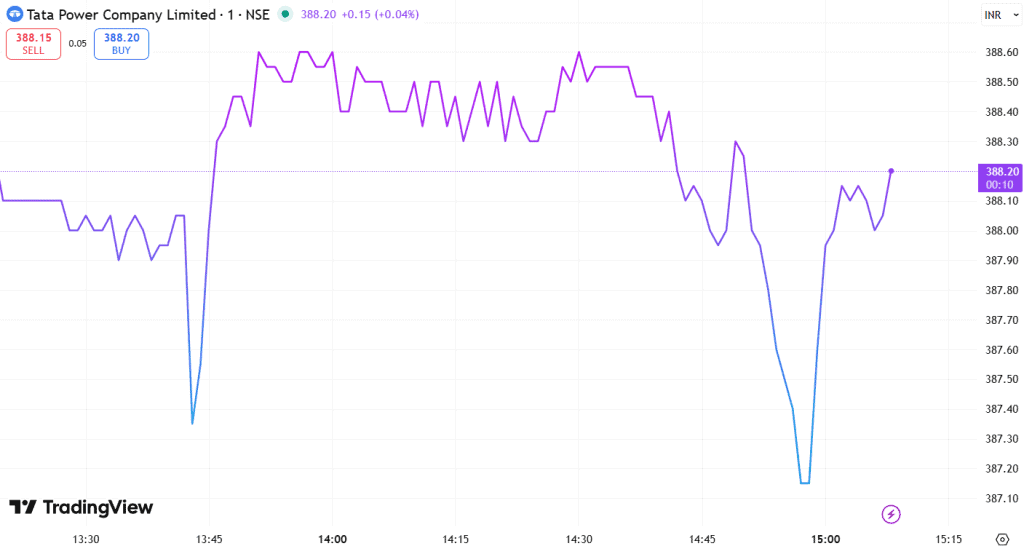
A line chart is a simple graph that connects the closing price of a stock over time and helps traders to quickly identify the overall trend of a stock. It’s a single line that moves up or down based on the closing price.
Bar Chart
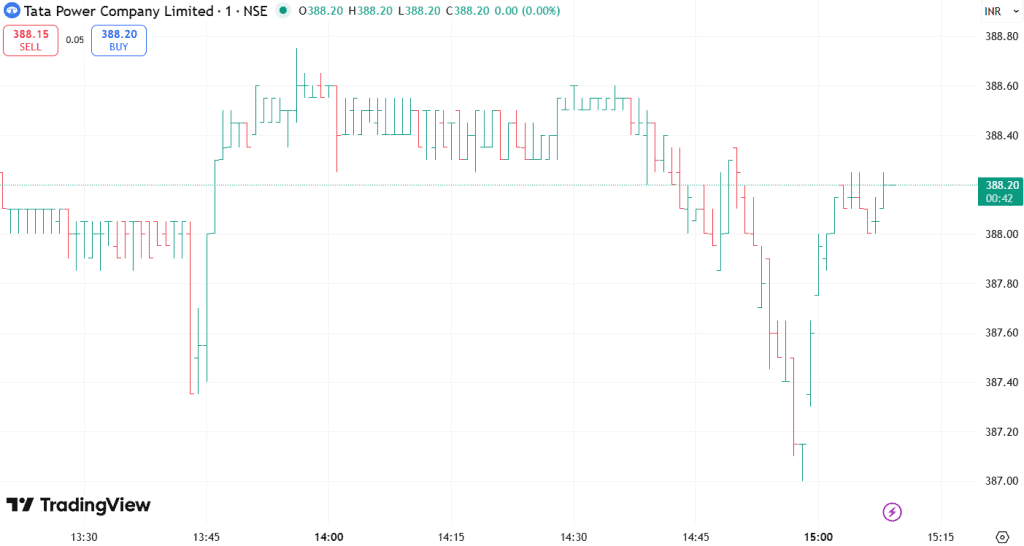
A bar chart includes the opening, highest-lowest, and closing prices (HLOC) for each timeframe. It helps the traders to gain more detailed insights into a stock’s price within each period. Here, each bar represents a period, for example, a day. A vertical line shows the highest price and the lowest price or the bottom of that period. The short line on the left side of the bar shows the opening price, while the one on the right shows where the price closed.
Candlestick Chart
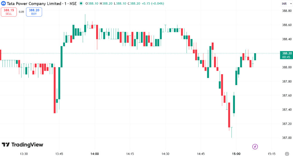
A candlestick chart represents the open, high, low, and close for each period, and visually highlights the relationship between these prices. It is used for detailed analysis and is the most popular type of chart for technical analysis.
How to read it?
- Real Body: The central rectangle shows the distance between the opening and closing prices.
- Colour: The colour of the body represents price movement.A green body indicates the price closed above the opening level, while a red body shows the price closed below it.
- Shadows: The thin lines stretching above and below the body, also known as wicks, mark the highest and lowest prices reached during that period.
- Patterns: Different candlestick shapes indicate different meanings, whether it’s potential price reversals or continuations.
Key Components of a Stock Market Graph
A stock chart packs multiple signals into a visual that helps to understand price behaviour, trading activity, and market sentiment.
Price Movement (Open, High, Low, Close)
Price movement shows how a stock behaved within a timeframe by capturing its opening price, highest and lowest points, and closing price. These values appear as a candlestick, with the body showing the open and close and the shadows marking the high and low. A green body signals the close finish above the open, while a red body shows it closed below.
Volume Trends
The Volume trends represent the number of shares that were traded during a period. The volume bars, shown below the price chart, help in confirming price action. A high volume on a price move suggests strong conviction, while a breakout on low volume may not be sustainable.
Timeframe Selection
It is the period of time the chart covers, which allows the traders to view the performance of a stock over different periods, such as 1-day, 5-day, 1-month, 1-year and shorter or longer. The intraday traders may focus on the shorter timeframes, while long-term investors might look at multi-year charts to understand the historical trends and performance across market cycles.
How to Analyse a Stock Market Graph Step by Step
Here’s a simple process to turn raw price action into clear trading signals and decisions.
Identify Trend Direction
The trend direction shows whether the stock is rising, falling, or moving sideways. An uptrend forms when the prices create higher highs and higher lows, while a downtrend forms with lower lows and lower highs. The traders can visualise this movement better by drawing trendlines, while stronger volume during these moves often confirms the trend’s reliability.
Understand Support & Resistance Levels
The support and resistance mark the price zones where buying or selling pressure tends to slow down movement. The support acts as a price floor where the buyers usually step in, while the resistance acts as a ceiling where the sellers dominate. These zones are spotted using the trendlines or moving averages.
Spot Chart Patterns
The chart patterns form naturally as the prices move, while hinting at whether a trend might continue or reverse. The reversal patterns, such as Head and Shoulders or Double Tops or Bottoms, point towards a shift in direction, while flags, triangles, and similar structures signal continuation. A pattern becomes more convincing once the price pushes beyond its boundary.
Use Indicators for Confirmation
The indicators help to validate what the price chart already suggests. The tools, like moving averages, show the direction, while momentum tools, such as RSI or MACD, reveal the strength behind the price swings and highlight overbought or oversold zones. The traders usually combine different indicators with chart action, which leads to stronger and more reliable analysis.
Real Example of Stock Market Graph Analysis
Let’s understand how to analyse a stock market graph using the Nifty 50 Index 1-day 1-minute chart.
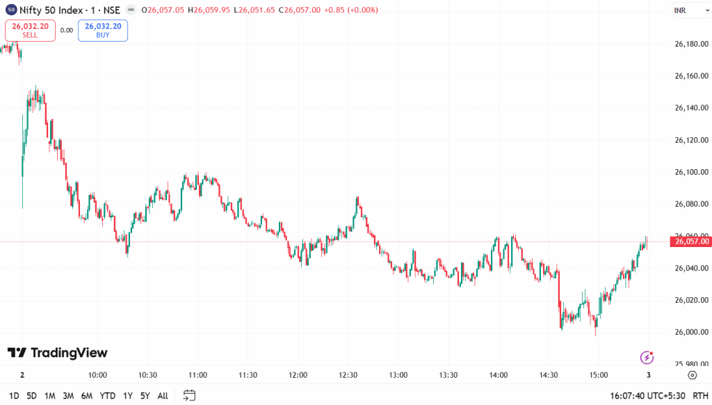
This Nifty 50 1-minute chart shows a clear downtrend through most of the session, with lower highs and lower lows forming consistently.
After hitting a support zone near 26,000, the price begins to stabilise and builds a small base. Towards the end, the buyers step in and push the price upward, creating a short recovery. This chart simply shows how the trends weaken, support forms, and momentum shifts as the session progresses.
Best Tools for Stock Market Graph Analysis
Stoxo, a stock market AI by Stockgro, makes chart analysis easier for everyday investors by turning complex market data into clear, digestible insights. The investors can ask it anything, from price trends to sector movement, and it breaks things down in a way that actually makes sense. It helps them to understand patterns, momentum shifts, and overall market behaviour without drowning in indicators or jargon.
Stock Market Graph Mistakes to Avoid
- Emotional Trading: The trader must avoid making decisions based on emotions such as fear, greed, or hope, rather than objective analysis, as it could lead to impulsive actions.
- Ignoring Volume Confirmation: The price movements are more reliable when confirmed by high trading volume, and failing to check the volume can lead to falling for false breakouts or reversals.
- Paralysis by Analysis: The traders must avoid using too many indicators or chart types, as it can lead to confusion, conflicting signals, and indecision.
- Failing to Implement a Trading Plan and Risk Management: If a trader enters a trade without a pre-defined strategy, with clear entry-exit points, stop-loss orders, and proper position sizing, it could be a major pitfall.
Final Takeaway
Stock Market Graph Analysis helps traders to understand how the prices move, how they react, and how strong or weak a trend is. The traders can interpret the market behaviour with more clarity by studying trends, key levels, patterns, and indicators. And with the right tools and a steady approach, the charts become a guide for smarter and confident decisions.
FAQs
A stock market graph visually represents how the price and volume change over a period of time. It helps traders spot trends, key levels, and shifts in momentum, making analysis easier and more structured.
A beginner can read a chart by starting with checking the trend and noting the support and resistance levels. Then, they need to look at candlesticks for price behaviour and use basic indicators to confirm what the chart already shows.
The candlestick charts are popular and preferred because they clearly show the open, high, low, and close, making patterns and price behaviour easier to understand.
The graphs don’t predict, but they reveal patterns, trends, and momentum, which help the traders to estimate the direction of price movement.
The intraday traders might prefer shorter timeframes such as the 1-minute, 5-minute, or 15-minute charts to track price swings and identify entry and exit points.
The tools and platforms such as TradingView, Stoxo, TrendSpider, and Zerodha Kite offer strong charting features, indicators, and drawing tools that help users to study price action effectively.

Leave a Comment