One of the biggest problems in the markets is that the same data can be interpreted in many ways and investors are left unsure how to read the market. Economic reports, company results and global news can move prices but without a framework the signals can seem random or even contradictory. This lack of transparency is why new participants struggle to know if the market is trending or just going through a phase.
To address this, stock market chart analysis provides a framework to study price action through visual patterns, candlesticks and indicators. In fact a study found that 89% of day traders use technical charting to read these signals, it’s that widespread.
In this blog we will cover the basics of stock market chart analysis and show how charts, price and volume work together to make market movements easier to understand.
What Is Stock Market Chart Analysis?
Stock market chart analysis is the study of a stock’s historical price, performance over time and volume data to find trends and patterns. By looking at a graph of a performance analysts try to understand market sentiment and predict future price movements. This analysis involves different types of charts and technical indicators to get insight into the supply and demand of a particular stock. The main aim is to make informed trading decisions based on the information presented in the chart, to identify potential entry and exit points in the market.
Types of Charts Used in Stock Market Analysis
Charts are a fundamental tool in stock market analysis, helping investors visualise price movements, trends, and patterns. Today, tools like stock analysis AI can help interpret these charts faster and more accurately, showing main signals that guide investment decisions. Additionally, by understanding the main types of charts, traders and investors can use these insights effectively to plan their strategies. Here are some of them:
- Line Charts, Bar Charts & Basic OHLC Types
The simplest and most traditional forms of price representation are, including:
- Line charts: Built by connecting closing values across a chosen timeframe. They provide a simple view of price direction overall, though they miss finer intraday details.
- Bar charts: Show opening, high, low, and closing prices (OHLC) using vertical bars. They give more information than line charts and show volatility.
- Basic OHLC charts: A variation of bar charts that emphasize open, high, low, and close data, allowing traders to spot price range and momentum.
- Candlestick Charts: Anatomy & Common Styles
One of the most widely used formats for traders and investors are candlestick pattern, which include the following:
- Anatomy of a candlestick: Each candlestick represents open, high, low, and close. The bar body marks the open-to-close range, and the lines (wicks) show highs and lows.
- Bullish candles: Usually represented in green or white, signaling upward movement.
- Bearish candles: Shown in red or black, reflecting downward pressure.
- Common styles: Patterns like Doji, Hammer, and Engulfing Candles indicate possible reversals or continuations.
- Trend-Filtering Charts: Heikin-Ashi, Renko & Range Bars
Alternative charting methods that help filter market noise are, as follows:
- Heikin-ashi: A variation of candlestick charts designed to smooth price action and highlight clearer patterns.
- Renko charts: Emphasize only on price changes, ignoring time, by forming “bricks” when prices move by fixed increments.
- Range bars: Similar to Renko but form bars only when price moves beyond a specified range, reducing false signals.
- Point & Figure and Other Non-Time-Based Charts
Unique chart styles that break away from time-based plotting are, including:
- Point & figure (P&F) charts: Use Xs and Os to represent price movement, filtering out minor fluctuations and highlighting support/resistance.
- Kagi charts: Change thickness or direction based on price reversals, ideal for spotting trend strength.
- Three-line break charts: Display reversals only when prices move beyond the last three highs or lows, reducing market “noise.”
Time Frames & Scaling: Why Charts Look Different Over Time
The appearance of a stock chart can vary significantly based on the time frame and scaling used, which are chosen to suit different analytical approaches as follows:
- Time frame selection
Charts can be set to display data over various periods, from intraday intervals like one-minute increments to long-term views spanning months or years. Short-duration traders often rely on hourly or daily charts for quick price changes, while long-term investors use weekly or monthly charts for broader views. Each time frame provides a different perspective on the stock’s price action.
- Impact on chart elements
The selected time frame dictates how chart elements like candlesticks or bars are formed. For example, on a daily chart, every candle reflects the open, high, low, and close of that day. On a weekly chart, each candlestick consolidates the price action for an entire week, smoothing out daily volatility and highlighting the longer-term trend. This difference in data aggregation is why a stock’s chart can look dramatically different when switching between time frames.
Key Chart Patterns You Should Know
Knowing about different chart patterns is important in technical analysis as they provide info about future price action. Some key patterns are, as follows:
- Reversal Patterns: Head & Shoulders, Double Top/Bottom, etc.
These patterns signal the possible end of a trend, including:
- Head & shoulders: Suggests a reversal from bullish to bearish, with one large peak (head) between two smaller ones (shoulders).
- Inverse head & shoulders: The opposite, showing potential bearish-to-bullish reversal.
- Double top: Occurs when two peaks form at similar levels, showing resistance and possible decline.
- Double bottom: Two troughs at nearly the same level, signaling strong support and potential upside.
- Continuation Patterns: Flags, Pennants, Triangles
The formations imply an existing movement is likely to carry on. Few of the core continuation patterns involve:
- Flags: Small rectangular patterns forming after sharp price moves; often suggest trend continuation.
- Pennants: Small symmetrical triangles appearing after steep rallies or drops, followed by continuation.
- Triangles: Can be ascending, descending, or symmetrical, representing consolidation before breakout in the same trend direction.
- Other Patterns: Gaps, Wedges, Cup & Handle
Additional price behaviors that offer trading insights are, including:
- Gaps: Sudden jumps in price due to strong buying/selling interest; can signal trend continuation or exhaustion.
- Wedges: Converging trendlines that can indicate both reversal and continuation depending on breakout direction.
- Cup & handle: A rounded bottom followed by a small pullback, usually indicating a bullish continuation setup.
Indicators for Enhancing Stock Market Chart Analysis
Technical indicators are calculations based on a stock’s price, volume, or open interest that are used to anticipate future price movements, and some of the most common types are the following:
- Trend Indicators (Moving Averages, ADX, etc.)
These are used to assess the direction of the market, such as the following, such as the following:
- Moving averages (MA): A moving average is a tool that averages prices over time, creating a line that evens out fluctuations. A simple moving average (SMA) calculates the mean price for a set period, while an exponential moving average (EMA) assigns more weight to recent prices. Prices trading above the moving average are generally seen as bullish, while trading below may suggest weakness.
- Average directional index (ADX): The ADX evaluates how strong a trend is, regardless of direction. Plotted as one line ranging between 0 and 100. Readings under 20 indicate a weak or absent trend, while over 25 shows strong conditions.
- Momentum & Oscillators (RSI, MACD, Stochastic)
Momentum indicators and oscillators help to determine the speed of price movements and identify potential reversals, such as the following:
- Relative strength index (RSI): The RSI is an oscillator that measures the pace and degree of price changes. RSI moves between 0 and 100 and is often applied to spot overbought (above 70) or oversold (below 30) zones.
- Moving average convergence divergence (MACD): A trend-following momentum indicator, MACD that tracks the link between two moving averages of price. When the MACD line rises above the signal line, it is bullish; a fall below indicates bearishness.
- Stochastic oscillator: The stochastic oscillator compares a closing price against its price range over a period. It helps flag overbought or oversold signals within a 0–100 scale.
- Volume & Volatility Overlays (Bollinger Bands, Volume Profile)
Volume and volatility indicators provide insights into the conviction behind price moves and the degree of price fluctuation, including the following:
- Bollinger bands: Bollinger bands consist of a middle band being an N-period simple moving average (SMA), an upper band at K standard deviations above the middle band, and a lower band at K standard deviations below the middle band. The bands widen when volatility rises and contract when volatility decreases.
- Volume profile: The volume profile indicator outlines where trading activity was concentrated at specific price levels during a set period. It shows the price levels where the most and least volume has occurred, which can act as support and resistance levels.
How to Read & Interpret Charts: Practical Steps
Interpreting stock charts involves more than just looking at price movements; it requires a systematic approach to identify patterns and potential trading signals. By applying a few practical steps, traders can build a foundational understanding of chart analysis.
- Drawing Support & Resistance, Trendlines & Channels
The first step in chart reading is identifying key price levels and directional structures that guide market movements. Common tools for this purpose, such as support and resistance, trendlines, and channels, are as follows:
- Support and resistance: The major concepts in charting analysis. Support is a level where falling prices may pause due to buying interest. Resistance is where rising prices may stall or reverse because of selling pressure. These levels are often found by spotting past points where prices repeatedly bounced upward (support) or pulled back downward (resistance). Drawing horizontal lines at these levels can provide a clear visual reference.
- Trendlines and channels: A trendline is drawn over highs or under lows to map price direction. In an uptrend, the trendline is drawn under the lows (a support line), and in a downtrend, it is drawn over the highs (a resistance line). Channels are created by placing a parallel line alongside the trendline
For an uptrend, this parallel line is drawn over the highs, and for a downtrend, it’s drawn under the lows. This channel contains the price movement and can help anticipate future support and resistance areas.
- Recognizing Breakouts & False Breakouts
Once key levels are established, the next step is to evaluate how price reacts around them. Important scenarios to watch for, including breakouts and false breakouts, are:
- Breakouts: A breakout happens when price moves beyond a set support or resistance, usually with higher volume. A breakout above a resistance level suggests the price may continue to trend upward, while a breakout below a support level indicates the price could continue to fall. Valid breakouts often pair with rising trade volume to confirm the move’s strength.
- False breakouts (or “Fakeouts”): A false breakout happens when the price moves beyond a support or resistance level but fails to sustain the move and quickly reverses back into its previous trading range. This can trap traders who entered positions based on the initial breakout. To avoid being caught in a false breakout, it’s often wise to wait for confirmation, such as the price closing significantly beyond the level for a couple of periods, before committing to a trade.
- Using Multiple Time-Frames for Confirmation
Analyzing a stock chart on a single time frame can provide a limited perspective. A more robust approach involves using multiple time-frames to confirm signals and understand the broader market context.
- Top-down analysis: Traders often begin with long-term charts (weekly or monthly) to ascertain the dominant trend.
Then, move to an intermediate-term chart (e.g., daily) to identify more specific patterns and key levels within that trend. Finally, use a shorter-term chart (e.g., hourly or 15-minute) to pinpoint precise entry and exit points. If the long-term trend is bullish, a trader would look for buying opportunities on pullbacks on the shorter-term charts. This alignment of multiple timeframes can improve the likelihood of accurate setups.
As the field of stock market ai evolves, new tools are surfacing to aid with this process. Platforms like Stoxo AI provide AI-powered research and intelligence, which can help investors synthesize information and validate their analysis across different market conditions.
Tools & Platforms for Chart Analysis
A variety of platforms and tools are available to assist investors and traders in conducting stock market chart analysis, including the following:
- Charting software and websites: Various brokers provide tools with charting features packed with indicators and drawing options.
Dedicated charting platforms like TradingView provide advanced features, customizable layouts, and social networking components, allowing users to share and discuss their analyses. These platforms often come with both free and paid subscription tiers, with the latter offering more advanced functionalities. - Stock screeners: To efficiently identify trading opportunities from thousands of listed companies, traders rely on various stock screeners. Screener.in is a highly popular platform for conducting detailed fundamental screening based on financial ratios. For technical scans, StockEdge is a widely used mobile and web app that offers a vast library of pre-built scans based on indicators, candlestick patterns, and price action.
- AI-powered research engines: A new generation of tools utilises artificial intelligence to simplify the research process. Stoxo AI is primary evidence of this. Launched by StockGro, is an AI-powered engine designed for retail investors in India. It provides real-time market intelligence and allows users to ask specific questions about stocks and market trends, receiving well-researched and easy-to-understand answers, which helps in making more informed decisions.
Case Studies: Real-World Chart Analysis Examples
Applying theoretical knowledge to real charts is the best way to develop analytical skills. Looking at the daily chart of Reliance Industries Limited below we can see two clear setups where chart patterns, support and resistance levels and indicators come together to give trading signals.
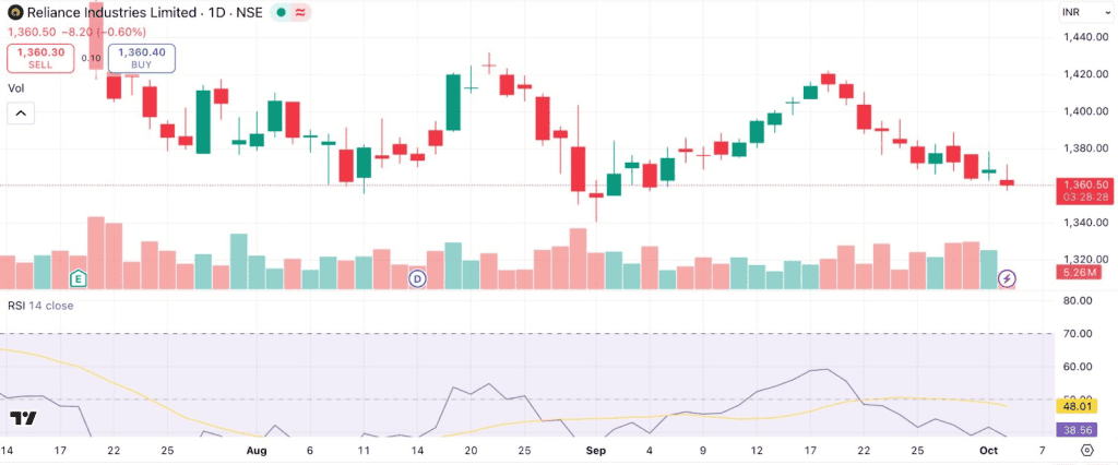
In late August the stock approached the ₹1,420-₹1,425 zone but could not break through. When tested again in mid September it was rejected at the same level and became strong resistance. At the same time support was appearing near ₹1,360 and was creating a well defined trading range. These two peaks formed a classic Double Top pattern, a bearish reversal signal further confirmed by the RSI showing lower highs and a dip below 50. Red rising volume bars indicated that the down move was supported by active market participation.
A different kind of setup was seen in August when the stock had fallen sharply and the RSI was near the oversold zone near 30. The price at that time was consolidating just above ₹1,300 and was showing that buyers were defending this level. As the RSI started to turn up from the oversold area the stock rebounded and gained strength and eventually rallied back to ₹1,420 over the next few weeks. This bounce shows how momentum indicators like RSI can help traders spot reversal points on the downside especially when they align with visible price supports.
Together these two setups, one bearish reversal at resistance and one bullish rebound from support show how stock market chart analysis can help us interpret market behavior better. By combining price levels, candlestick behavior, RSI signals and volume confirmation the chart gives us high probability insights that go beyond random price movements.
Common Mistakes & How to Avoid Them
When analysing stock charts, traders can fall into several common traps. Spotting these mistakes is the first step toward reducing them.
- Ignoring the bigger picture: A frequent error is focusing too heavily on short-term patterns without considering the broader market trend. A bullish pattern in a strong bear market is less likely to succeed. To avoid this, always start with a top-down analysis, looking at longer time frames (weekly, monthly) before zooming into shorter ones (daily, hourly).
- Overcomplicating the analysis: Using too many indicators can lead to “analysis paralysis,” where conflicting signals make it difficult to make a decision. It’s better to master a few key indicators that you understand well rather than cluttering your charts with every available tool.
- Disregarding volume: A breakout without volume strength often gives a false reading.
Volume helps confirm the potency of price action. A significant price increase accompanied by high volume is a much stronger bullish signal than the same price move on low volume. Always check the volume to validate price action. - Emotional trading: Fear or greed can cause impulsive trades that conflict with planned analysis. To prevent this, traders often create a defined plan with fixed entry and exit points and follow it strictly. This practice reduces emotional influence in making decisions.
Conclusion
Through stock market chart analysis, historical price and volume data can be organised into meaningful patterns. Different charts, indicators, and time frames create perspectives on market behavior without guaranteeing specific outcomes. This analytical approach offers a way to observe price movements, compare trends, and assess fluctuations, reflecting the diverse interpretations and applications used across financial markets.
FAQs
The main types of charts used in stock market analysis are line charts, bar charts (OHLC), candlestick charts, Renko charts, Heikin-Ashi charts, point & figure charts, Kagi charts, range bar charts, and three-line break charts. Each visualizes price and trends differently for various analytical needs.
Candlestick charts display open, high, low, and close prices with visually distinctive bodies and wicks, effectively illustrating bullish and bearish sentiment. Bar charts present similar OHLC data as vertical bars, while line charts simply connect closing prices over time, offering a broad view but lacking intraday detail.
Renko charts filter noise by using fixed brick sizes triggered only by price change, making them ideal for trend identification. Heikin-Ashi charts smooth price data for clearer trend signals, useful in swing trading. Point & figure charts ignore time, highlighting just significant price moves and major support/resistance levels.
Reversal patterns such as head & shoulders, double tops/bottoms, and inverse head & shoulders signal possible trend changes. Continuation patterns like flags, pennants, and triangles show trends are likely to continue. Gaps, wedges, and the cup-and-handle also suggest either reversal or continuation, depending on breakout direction.
Choose time frames based on your trading goals: short-term traders analyze intraday (minutes, hours) or daily charts; swing traders may use daily and weekly charts; long-term investors often rely on weekly or monthly charts to capture major trends. The selected time frame impacts how chart elements appear and which patterns are visible.
Confirm chart patterns by analyzing volume for conviction, using MACD for trend direction or momentum shifts, and checking RSI for overbought or oversold signals. Combining patterns with indicator confirmation increases reliability: for example, a breakout backed by rising volume and bullish MACD crossover strengthens trend reversal signals.
Common mistakes in stock market chart analysis include overcomplicating charts with too many indicators, misreading chart patterns out of context, ignoring larger time frame trends, failing to confirm signals with volume, and letting emotions such as fear or greed dictate trades. Not using stop-loss orders and neglecting risk management also lead to unnecessary losses.
Free chart tools are generally sufficient for most retail investors and offer core features like candlestick charts, indicators, and pattern recognition. They cover basic needs for stock market chart analysis. However, premium tools may provide advanced analytics, customisation, real-time data, and automation, which benefit active traders or professionals seeking deeper insights.

Leave a Comment