Have you ever thought about how the top traders are able to spot the trend shifts before everyone else? The answer is very simple: price-action tools. Bar charts are one of these tools offering clean and structured information. As these tools become more prevalent in trading, it becomes crucial to understand how they work and how to use them effectively.
This article will give you a detailed walkthrough of bar charts, how they work, how to read them, their types, their patterns, and common mistakes to avoid.
What is a bar chart in technical analysis?
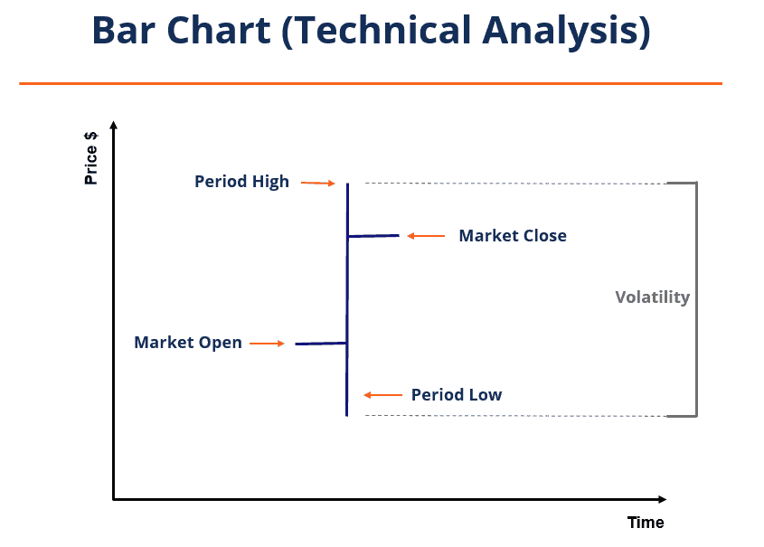
A bar chart shows the movement of a stock price over a specific time period. Each bar represents a trading session, which can range from one minute to an hour, a day, a week, or even a month. Traders use bar charts in their technical analysis to identify trends, measure volatility, and assess the momentum strength with high accuracy.
They help in understanding the trend and its direction during each session. This makes bar charts a reliable tool for planning entries, exits, and risk levels across different timeframes.
Structure of a price bar
Each bar chart has four elements that offer information regarding the price movements. These four elements are:
Open: It is the first price at which the stock is traded at the beginning of the period. It is represented by a small line on the left side of the bar.
High: It is the highest price that the security reached during the trading period.
Low: It is the bottom of the bar showing the lowest price the stock reached during that session.
Close: It is the closing price of the stock at the end of the trading session, represented by a line on the right side of the bar.
How bar charts are built on different intervals
The bar charts can be built based on different types of intervals, based on different data types. The intervals influence how the price movements are interpreted.
1. Time-Based Bars
In time-based bars, each bar represents a fixed period of time, regardless of the number of trades that happen during it. They are the most common type of bar charts.
Examples: 1-minute, 5-minute, daily, weekly, monthly bars
2. Tick-Based Bars
In tick-based bars, a new bar is formed after a fixed number of trades take place. They are not bound by time frames. High-frequency traders like to use these bars as they reflect actual market activity.
Example: A 200-tick bar forms after 200 transactions.
3. Volume-Based Bars
In this type, each bar represents a trade volume instead of the time and tick size. They are useful in identifying the momentum and direction of the market.
Example: A volume bar is formed after 5,000 shares are traded.
4. Range Bars
Range bars form only when the price moves a certain number of points. They eliminate the time factor and focus only on the price movement.
Example: A 10-point range bar forms only when the price moves 10 points.
How to read a bar chart
When we read a bar chart, factors like the shape, position, and gaps need to be carefully studied. These are the key factors that should be considered:
1. Widening Range Bars
A widening bar means higher market volatility, where the distance between high and low is significantly greater than the previous bars. When the closing price is positioned near the high of the bar, it means the buyers are gaining strength. On the other hand, if the closing price is near the low, it means that the sellers are in control.
2. Narrowing Range Bars
When the range bars are getting narrower, it means the market is getting less volatile. When narrow bars start appearing in sequence, it is a signal that a breakout might be approaching.
3. Gaps
A gap is formed when a stock opens significantly higher or lower than the previous day’s closing price. They indicate strong market sentiment and are often caused by major economic events,the release of annual reports, or a shift in investor expectations.
4. Close Location Value (CLV)
The position of the closing price within the bar indicates the strength and direction of the market momentum. When it closes near the high, there is bullish momentum, and when it closes near the low, there is bearish sentiment. A closing position at or near the midpoint of the bar represents a neutral trading session.
Bar chart vs candlestick vs line:
The following table shows how bar charts differ from other popular chart types:
| Parameter | Bar Chart | Candlestick Chart | Line Chart |
| Data | Shows the full Open, High, Low, Close (OHLC) clearly without clutter | Shows OHLC along with wicks that reflect the sentiment | Shows only the closing price for each period |
| Visual | They offer a clean visual that focuses on structure | Their visuals are heavily detailed, which makes interpretation easier | Simple and smooth visuals, ideal for broader trend view |
| Suitability | Professionals who prefer clean data and less visuals | New and pattern-based traders | Long-term investors looking for simplicity and trend clarity |
| Use Case | Detailed price analysis and volatility assessment | Spotting reversal patterns and emotional market behaviour | Identifying the overall direction of a security without noise |
Types of Bar Patterns in Technical Analysis
The bars form different patterns on the chart, which are used in identifying the momentum shifts and direction of the market. The most common patterns used for trading are:
Inside Bar
An inside bar is formed when the high and low of the current bar stay completely within the range of the previous bar. This is a simple but powerful pattern that indicates reduced volatility and indecision among traders. It usually precedes a breakout.
Example: If Stock A forms multiple inside bars near the resistance level, a breakout is possible in the following trading sessions
Outside Bar (Expansion Bar)
When a stock’s current high is higher, and its low is lower than the previous bar, an outside bar is formed. It is also known as an expansion bar. This pattern reflects an increase in volatility and often appears before the reversal or acceleration of a trend.
Example: If Stock B forms an outside bar with a higher high and lower low than the previous session, it signals a surge in volatility and a possible trend acceleration.
Indicators commonly paired with bar charts
The bar charts are often combined with other technical indicators for confirmation of the signal and improved accuracy. These indicators add reliability to the bar charts and help in the identification of trends and momentum shifts.
1. Moving Averages (MA)
Moving averages are used to smooth out the minor fluctuations in price and identify trend direction. The most commonly used MAs are:
- 20-day EMA for short-term scalping
- 50-day SMA for swing trading
- 200-day SMA for long-term trend confirmation
2. Average True Range (ATR)
The Average True Range (ATR) is used to measure market volatility. When the ATR increases during the expansion of bars, it confirms a strong trend. It is helpful for assessing the risk and placing stop losses.
3. Volume
The volume shows the strength behind a price movement. It displays the participation of buyers and sellers in a particular trading session. When a breakout or trend is backed by high volume, it becomes more reliable.
Strategy snippets
There are different trading strategies based on the bar chart that help to identify entry zones, trend direction, and entry and exit points. The two most common of these strategies are:
Strategy 1: Breakout on Expansion Bar
- Firstly, identify a clear consolidation zone where the price moves within a tight range.
- Wait for an outside bar that signals a surge in volatility and a strong trend.
- Take entry when the stock climbs over the high of the outside bar, which signals the start of a bullish phase.
- Place the stop-loss just below the low of the expansion bar to protect against false breakouts.
Example: If a stock is trading in the range of ₹150-₹155 for many days, and suddenly an expansion bar with ₹160 is formed. It presents a strong bullish move and offers an entry position. Place the stop-loss below the low of the expansion bar.
Strategy 2: Pullback to Moving Average
- Make trades only in the direction of the existing trend, which improves the accuracy and reduces noise.
- Wait for the price to pull back towards the 20-day EMA or 50-day EMA, which acts as the resistance level.
- Enter the trade when a bullish bar forms near the moving average, indicating that the pullback is ending.
Example: A stock rallies from ₹200 to ₹240 and then pulls back to the 20-day EMA around ₹230. After this, a bullish up-bar is formed, suggesting the trend may resume and offering a clean long entry.
Advantages and Limitations of Using Bar Charts
We need to evaluate the advantages and limitations of bar charts before we use them for trading. The bar charts have the following:
Advantages
1. Clean representation: Bar charts present the complete OHLC (Open. High, Low, Close) data in a clear and structured format that filters unnecessary visual noise and helps focus purely on the price.
2. Pattern-friendly: They are highly effective for spotting price patterns, volatility shifts, and momentum strength, which helps in making trade decisions.
3. Flexibility: The bar charts are flexible and can be used for different time frames, such as intraday, daily, weekly, or monthly.
4. Trend insight: They provide accurate information regarding trend shifts and momentum strength, which helps in making more confident decisions.
5. Bias-free: Bar charts are more neutral, focusing on structure rather than the visual aspect. It removes the biases and gives more clarity while trading.
Limitations
1. Learning curve: Bar charts can feel challenging for traders who have just started, as they lack the visual cues present in other charts, like the candlestick.
2. Less visual impact: They do not convey the market sentiment as deeply as the colorful representation in candlesticks, making them less intuitive.
3. Experience required: Reading bar chart patterns requires more market experience, as the subtle shifts need to be interpreted with precision.
4. Slower pattern recognition: It is harder to spot quick reversal signals or emotional market reactions in bar charts.
Common mistakes
Misinterpretation of bar chart signals can negatively impact the accuracy and success of trading. As a trader, one should look out for the common mistakes listed below:
Mistake 1: Overfitting Patterns
Looking to fit in patterns where they don’t exist can create false signals and result in poor trade entries.
Mistake 2: Ignoring Volume
Breakouts without significant volume are meaningless. They are more prone to failure as they lack market conviction.
Mistake 3: Trading Against Trend
Trying to read and trade with the bar chart patterns without understanding the broader market context and direction often results in losses.
Mistake 4: No Risk Management
Bars can be highly volatile, trading without stop-losses can deplete your capital. It becomes important to use proper risk management techniques.
Conclusion
Bar charts are one of the most effective tools for analysing market direction, spotting momentum shifts, and planning precise entry and exit points. They have a clean OHLC representation that helps traders identify trends without unnecessary noise. When bar charts are used with indicators like ATR, MA, and proper risk management, they can significantly improve the quality of trading decisions. Mastering the bar charts helps in developing a strong foundation for navigating the market with confidence.
FAQ‘s
A bar chart shows the open, high, low, and close (OHLC) for each period, helping traders assess trend strength and volatility.
Expansion bars signal rising volatility and potential trend acceleration, while inside bars indicate consolidation and the possibility of a breakout.
A bar chart focuses on a clean OHLC structure, whereas candlesticks use colour and body shape to visually highlight market sentiment.
Indicators like MA, ATR, and volume work best with bar charts. MAs show trend direction, ATR measures volatility, and volume indicators confirm the strength behind breakouts or reversals.