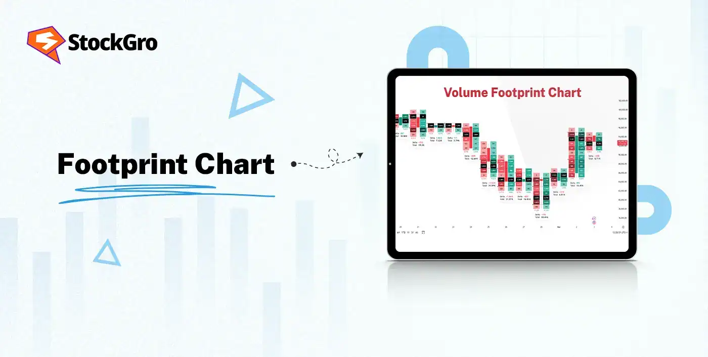
Price action can look smooth on the surface, but the real story often sits inside the candles. That’s where a Footprint Chart comes as a game-changer for the traders. The footprint chart is an advanced form of a candlestick chart that represents the trading volume at different price levels for a period of time.
The footprint chart breaks each price level into buyer-seller activity, letting the traders see who’s in control, where the momentum is thinning out, and whether a move has real strength behind it. This visibility helps the traders to judge entries, filter fake breakouts, and understand the intent behind every push in the market.
This blog aims to provide a complete guide to understanding the Footprint Chart, its components, how to read it, and more.
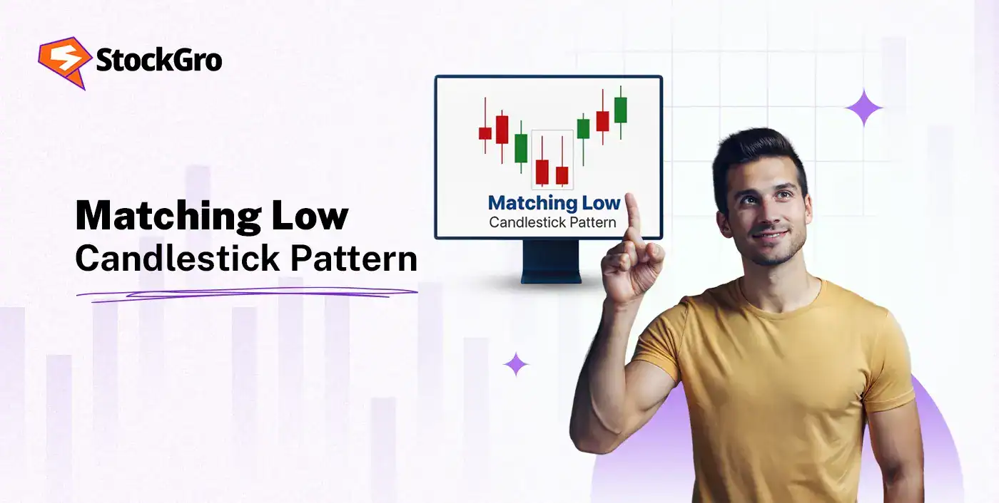
What is a Footprint Chart?
The footprint chart is an advanced candlestick chart that represents trading volume at different price levels within a time period. It reveals the interaction between the buyers and the sellers with more clarity than a standard candlestick chart.
It shows the number of buy and sell orders executed at each price point, which provides the visuals of the footprint of the market activities and helps the traders to measure real-time buying and selling pressure.
Structure & components of a Footprint Chart
Let’s understand the components and structural features of the footprint chart:
Buyer vs Seller Volume Separation
The volume is split into two components at every price level, within each bar in a footprint chart. The first one is bid volume or selling pressure, which represents the trades initiated by market sell orders hitting the standing bids by the passive buyers. Next, ask volume or buying pressure, which represents the trades initiated by market buy orders raising the standing offers or asks by the passive sellers.
This separation is visualised using different colors, for example, red for sell volume, green for buy volume, or by displaying the bid volume on the left side of the price cell and the ask volume on the right.
Delta, Imbalance, and Point of Control
The delta is the difference between the buying or ask volume and the selling or bid volume for a period, for example, within a single candle or at a specific price level. A positive delta indicates net aggressive buying pressure, while a negative delta indicates net aggressive selling pressure. The running total of the delta across multiple bars offers insight into the overall market sentiment.
An imbalance occurs when there is a significant disparity between the buy volume and sell volume at parallel price levels, which indicates an aggressive order flow on one side of the market.
The Point of Control (POC) is the price level within a particular timeframe, for example, within a single candle, where the greatest volume of the trading activity has occurred. The developing POC can track how this high-volume node moves in real-time as a bar forms.
How to read a Footprint Chart: Step-by-Step
Let’s understand step-by-step how to read a footprint chart!
Reading Volume Clusters & Price Levels
- Identify high-volume nodes: The traders might look for price levels where a large amount of trading volume takes place within the footprint chart.
- Recognise support and resistance: The high-volume nodes act as strong support or resistance levels, as both buyers and sellers are interested in that price area.
- Analyse imbalances: The traders would pay attention to where volume clusters form, as a high concentration of volume at a particular price level suggests a turning point or a level where significant price action may occur next.
Key signals: Absorption, Exhaustion, Imbalances
- Absorption: It occurs when one side of the market, let’s say, the buyers, absorbs the orders of the other side, the sellers, at a certain price level. In this situation, a large amount of volume is traded against an existing order book, and the price fails to move in the direction of the aggressive orders.
- Exhaustion: It happens when a large spike in volume fails to cause a big price move and suggests that the momentum is fading. It can be identified by observing a high-volume bar where price action stalls or reverses, even though a lot of contracts were traded.
- Imbalances: It refers to a noticeable difference between the volume traded on the ask or selling and the bid or buying at a particular price level. The traders can identify it by observing the cells with a large imbalance, where one side’s volume is significantly higher than the other.
Footprint Chart vs Other Tools
Check out how footprint charts work in comparison to traditional candlestick charts and other tools, such as depth of market and order book.
Footprint vs traditional candlestick charts
| Features | Footprint Charts | Candlestick Charts |
| Depth of Analysis | It provides in-depth volume and order flow analysis to identify where activity is concentrated | It provides basic price action and patterns |
| Complexity | It is more complex and requires more interpretation | It is simpler and easier to interpret |
| Use Case | It identifies support or resistance, reversals, and entry or exit points based on volume imbalances | It offers general trend and pattern identification |
| Data Focus | It focuses on volume distribution within the price movement | It focuses only on price movement |
Footprint vs depth of market (DOM) / order book
| Features | Footprint Chart | Depth of Market (DOM) |
| What it shows | It represents the executed trades or volume at each price level within a candle | It represents pending buy and sell orders at different price levels |
| Information | It represents bid vs ask volume, delta, and imbalances from the executed orders | It represents the quantity of buy and sell orders waiting to be filled |
| Purpose | It analyses how much volume was traded at a price level and compares the aggressiveness of the buyers and the sellers | It analyses where liquidity is and where large orders are positioned to impact the price |
| Use Case | It helps in understanding what happened in the past to cause the price movement within a candle | It anticipates short-term price movements based on the imbalance of buy and sell orders |
Using Footprint Charts in Trading Strategy
The footprint charts provide a detailed view into the price action, which reveals the real-time interaction between the buyers and sellers at each price level. This order flow analysis may enhance trading precision for entries, exits, stop losses, and target setting.
Entry & exit signals
The footprint charts help the traders to enter and exit trades with better timing by showing where the real buying and selling orders took place. The retest of a strong high-volume node (HVN) signals a good entry or exit. The delta represents the changes in momentum, and imbalances and absorption highlight strong pressure from one side and can confirm breakouts or early reversals.
Stop-loss & target setting based on order flow
The order flow makes setting stop-loss more logical. The traders might place stop-loss just beyond a strong high-volume node (HVN), finished business levels where all orders were filled, or failed auction areas where the price wouldn’t return if the move is real. The target settings are set at the point of control (POC), low-volume nodes (LVNs), or liquidity zones where the price reacts or slows down.
Common Mistakes & Limitations
While the footprint charts provide valuable insights into the market dynamics, their effectiveness is limited in certain conditions, and they are subject to misinterpretation if not used correctly.
When footprint charts mislead (low volume, thin markets)
- Inaccurate Signals: In illiquid markets, small orders can have a disproportionate impact on the price movement, which might lead to distorted volume and delta readings that do not reflect institutional interest or true supply or demand dynamics.
- Lack of Data Quality: It is important to obtain timely, precise tick-by-tick data for an accurate footprint analysis. In markets with low activity or poor data feeds, the information displayed might be delayed or inaccurate, which might result in flawed conclusions.
How to avoid over-analysis & noise
- Focus on Insights: Traders need to avoid trying to explain every trade or minute detail on the chart and concentrate on the price levels, large volume clusters or high-volume nodes, and significant delta shifts or imbalances that might indicate aggressive institutional activity.
- Filter False Signals: Traders might use multiple timeframes to confirm the signals. For example, a signal on a shorter timeframe might be a false signal if the longer timeframe shows a conflicting trend or divergence.
Conclusion
The footprint chart turns an ordinary price action into a clearer picture of who’s driving the market at different price levels. It helps the traders to judge strength, identify reversals, and plan entries, exits, and risk with more intent by showing the real buying and selling activity. When the footprint chart is used in context to the market and discipline, it becomes a sharp tool for reading order flow.
FAQ‘s
The footprint chart is an advanced candlestick chart that represents trading volume at different price levels within a time period. It reveals the interaction between the buyers and the sellers with more clarity than a standard candlestick chart.
The traders can read a footprint chart by looking at the volume clusters, bid–ask volume, delta, and imbalances to see which side is stronger and where the price is likely to react.
The footprint chart might signal absorption, exhaustion, imbalances, delta shifts, and high-volume areas to help the traders judge reversals, breakouts, momentum changes, and support or resistance levels.
The footprint chart represents the executed buy and sell trades inside each candle. The volume profile represents the volume across a wider timeframe, and the depth of market (DOM) represents the pending orders waiting to be filled.
Yes, footprint charts are used in intraday trading as many traders use them to read short-term strength, momentum, and turning points with more clarity than a basic candlestick chart.
The footprint charts might be misleading in low-volume markets, create noise when overanalysed, and depend heavily on clean data and proper chart settings.