You enter a trade as per the standard indicators, default settings and within minutes, the trade flips in the opposite direction. In volatile markets, this situation gives you losses.
However, custom indicators for intraday trading will help you choose the correct direction and make a intraday trading strategy. Let’s check what are the best indicators and how they work.
What are intraday trading indicators?
Intraday trading indicators are made for the trader who wants to take decisions in compressed timeframes. Custom indicators for intraday trading are not just chart add-ons. They help traders break down market activity into usable signals.
Importance of intraday trading indicators
Here’s how custom indicators for intraday trading really help:
1. Entry and exit timing: With custom tuning, indicators generate high-probability trade signals. Indicators like VWAP and EMA help you avoid jumping too early or hesitating too late.
2. Support for pre-planned setups: Every trade idea begins with a hypothesis. Indicators validate candlestick patterns, confirm strength, and give measurable confirmation before you buy or sell a stock.
3. Stop loss and target levels:With the custom indicators for intraday trading, you can identify smart levels to limit downside and lock in profits.
4. Works well in the volatile market: During volatile sessions, traders jump at every stock that shows a high price movement and end up making losses.
Best intraday trading indicators
Here are the best intraday trading indicators that will help you plan all trades:
1. Relative Strength Index (RSI)
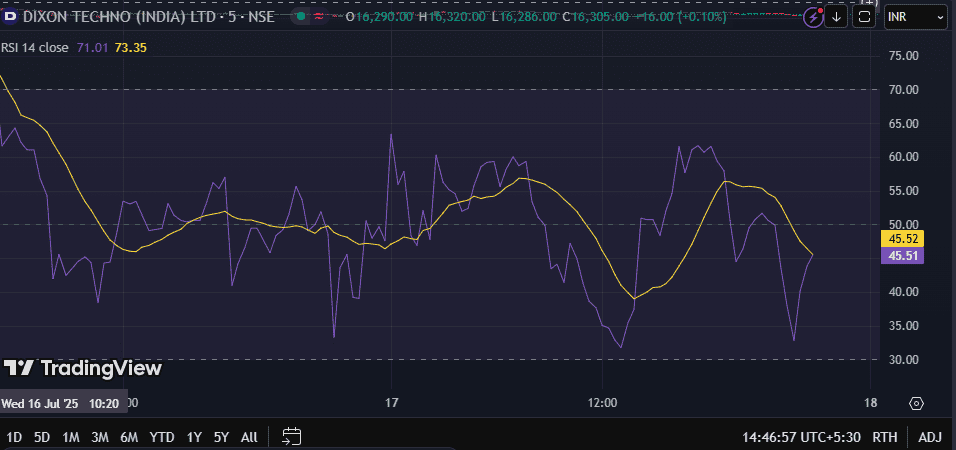
Traders use Relative Strength Index (RSI) to know how far prices have moved in recent sessions. It works on a scale of 0 to 100 and helps them identify if a stock is overbought or oversold.
RSI if reads above 70 shows that the asset has been overbought, while below 30 RSI can be seen if the stock has been oversold.
2. Moving Averages Convergence/Divergence (MACD)
MACD indicator works by comparing two moving averages of price, 26-period EMA and 12-period EMA. So, the difference between these two EMAs is shown as the MACD line.
Then there’s a second line called the signal line (a 9-period EMA of the MACD line). If the MACD line moves above the signal line, then the price might move upwards.
3. Exponential Moving Average (EMA)
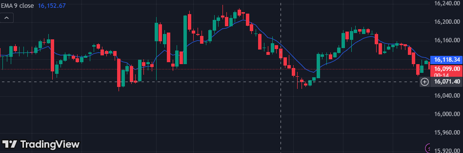
Many intraday traders use two EMAs together, like the 9-EMA and 21-EMA, to spot trends and crossovers. When the price stays above a short EMA, it means buyers have taken control.
If the 9-EMA crosses above the 21-EMA, it gives extra confidence in an upward trend. If the price keeps closing below both EMAs, it may suggest selling pressure.
4. Bollinger bands
Bollinger Bands use three lines: a middle line that has a 20-period simple moving average and the two other outer bands that are placed above and below it.
When the bands get closer together, it means the stock market has low volatility. When they spread apart, the market is more active. Traders watch for this change to catch breakouts or trend reversals.
5. Accumulation/distribution line
The Accumulation/Distribution Line (A/D Line) combines price and volume to help traders understand whether more people are buying or selling an asset.
The line goes up when the price closes near its high for the day and volume is strong. It goes down when the price closes near its low with high volume and this shows sellers may be stronger.
6. Stochastic oscillator
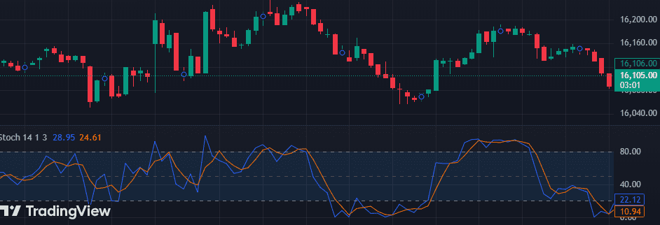
The Stochastic Oscillator compares the current closing price to the price range over the past 14 days.
It has two lines:
- %K – the main line
- %D – a version of %K
These lines move between 0 and 100:
If the lines go below 20 and then start to move up, it can be a sign of a bullish reversal. When they go above 80 and start to turn down, it may mean a bearish reversal.
7. Parabolic SAR
The Parabolic SAR shows the direction of a trend using small dots on a chart. If the dots move below the current stock price, the market is moving in an uptrend and vice versa.
If the dots switch from above to below, it can be a buy signal. If they flip from below to above, traders might have to sell the trade.
8. Pivot points

There are several key levels:
- The main level is called the Pivot (P)
- Below it are Support levels: S1, S2
- Above it are Resistance levels: R1, R2
If the price stays above the pivot, it shows buyers are strong. If the price breaks above R1 or R2 with high volume, it means the market is bullish.
9. Commodity channel index
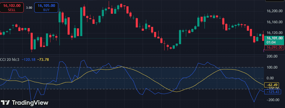
CCI is an indicator that shows that the price has moved far from its average. It’s different from RSI because it doesn’t have fixed limits; it can go way above +100 or below -100.
When CCI goes above +100, it means a strong buying trend might be starting. If CCI drops below -100, it shows strong selling.
10. Average Directional Index (ADX)
Average directional index has three parts:
- ADX line (trend strength)
- +DI (buying pressure)
- -DI (selling pressure)
Here’s how to read it:
- If this indicator value shows above 25, the trend is strong.
- If it’s below 20, the market is likely moving sideways.
11. Volume Indicator
Volume helps traders to know how many shares or contracts have been traded on that day. If volume increases with price, it shows the move is strong and supported. If the price goes up but volume is low, the move might be weak or fake.
During pullbacks, when the price drops but volume is low, it may mean sellers aren’t strong.
EMA 9-21 Crossover Strategy
The EMA 9-21 crossover is one of the simplest and most popular moving average strategies for intraday traders.
How it works:
- EMA 9 is the fast line — reacts quickly to recent price changes.
- EMA 21 is slower — shows the overall short-term trend.
Bullish signal: When EMA 9 crosses above EMA 21, it suggests short-term momentum is turning positive — often a buy signal.
Bearish signal: When EMA 9 crosses below EMA 21, it indicates weakening momentum — a potential sell signal.
Why it’s useful for intraday: This crossover highlights real-time momentum shifts, helping you enter trending moves early and exit when they fade.
Best EMA Crossover for 1-Minute Chart
On a 1-minute chart, speed matters. You want moving averages that respond quickly without too much noise.
A popular setup for scalpers & high-frequency intraday traders:
EMA 5 & EMA 13
- EMA 5 = ultra-fast reaction
- EMA 13 = short-term trend confirmation
This combo helps capture quick momentum bursts while filtering random price noise.
Another option some traders like:
EMA 8 & EMA 21
- Slightly smoother than 5 & 13
- Good balance of speed and trend confirmation
Conclusion
Traders who don’t rely on indicators end up losing their entry into the profitable trades. If they use custom indicators for intraday trading, they will be able to chase only true signals. Also, they will get to know about the price strength and volume shifts.
FAQs
Traders use VWAP for volume-pressure insight, RSI for spotting exhaustion, and EMA crossovers for early directional bias. If you’re using custom indicators for intraday trading, you can even combine elements like momentum plus volume.
Markets react to liquidity and sentiments. So, not all tools can anticipate every market move. Indicators only show how you personally analyze setups to help you react faster when the trades shift.
Most traders stick with 9 EMA and 21 EMA as a starting point. When the short-term line crosses the longer one, it’s often the first clue that the market is turning. Quick scalpers might drop down to 5/13 EMAs, while positional intraday traders lean toward 20/50.
When RSI breaks below 30 or above 70, it shows warnings that traders should not ignore. But one must use it with MACD or VWAP to spot signals. It helps to avoid the delay most standard signals suffer from.
Some indicators show momentum while others show exhaustion. If you scalp, your tools must be built for speed. If you trade as per the trends, you need better custom indicators for intraday trading.
There’s no single “best” indicator, but some favorites for intraday include:
✔ EMA crossovers (quick trend signals)
✔ RSI (overbought/oversold zones)
✔ MACD (momentum confirmation)
✔ VWAP (intra-day average price benchmark)
The best one depends on your trading style. Most traders use a combo of indicators for confirmation.
There’s no single formula, but a simple way is:
Collect historical intraday data (1-min/5-min).
Apply your chosen indicators (e.g., EMA crossovers, RSI).
Look at past trades where the indicator gave signals.
Count how many of those signals led to profit.
Profit probability = (Profitable signals / Total signals) × 100
This gives you a statistical edge — not a guarantee, but a probability based on past behavior.
For most day traders, combinations like these work well:
EMA 9 & EMA 21 – Trend and momentum focus
EMA 5 & EMA 13 – Quick signals on fast charts
EMA 8 & EMA 21 – Balanced responsiveness
Shorter EMAs are generally more responsive — perfect for fast intraday moves.
Important indicators for intraday trading include Moving Averages (especially 9 EMA and 20 EMA), VWAP (Volume Weighted Average Price), RSI (Relative Strength Index), MACD, Bollinger Bands, and Volume analysis. These indicators help traders identify trend direction, momentum, volatility, and potential entry and exit points within the same trading day.
There is no single “most accurate” intraday indicator. Accuracy depends on market conditions and how the indicator is used. Many traders rely on a combination of VWAP for trend direction, RSI for momentum, and volume confirmation to improve decision-making. Using multiple indicators together generally provides better reliability than relying on one alone.