The starting point of technical analysis is recognising how price is represented on a chart. That foundation begins with the candlestick. Each candle shows the full story of a trading period. You see where the price opened, how high or low it went, and where it closed.
Once you learn to read them, you’re not just seeing the price. You’re seeing pressure, hesitation, momentum, and reversal, all before the next move happens.
What Is a Candlestick Chart?
Each candle of the chart captures an asset’s price action over a defined timeframe ( whether a day, a week or a month) forming the fundamental unit of a candlestick chart. This visual format makes it easier to spot trends and patterns.
Each candlestick communicates four distinct values:
- Open: It reflects where trading began for that interval
- Close: It shows price at the end of that interval
- High: The highest point touched within the same interval.
- Low: The minimum price reached
Traders use these candles to interpret market movement with greater clarity.
History of Candlesticks
The origins can be traced to the 18th century Edo era of Japan, when rice commerce was a central part of regional life. And, tracking daily price movement became necessary for local merchants and brokers.
Munehisa Homma, a prominent rice merchant from Sakata, pioneered a technique that blended transactional detail with an awareness of crowd sentiment. His ideas were later codified in the Sakata Rules.
This technique remained largely within Japanese commercial circles until the 19th century. Charles Dow, who later co-founded Dow Jones, encountered it during his travels. He recognised their analytical value and incorporated aspects of Homma’s system into his own developing theories.
Decades later, Steve Nison, an American trader, revisited Homma’s legacy. Through careful adaptation and codifying new formations, he introduced candlestick analysis to a wider Western audience, significantly influencing modern technical analysis.
Components of a Candlestick
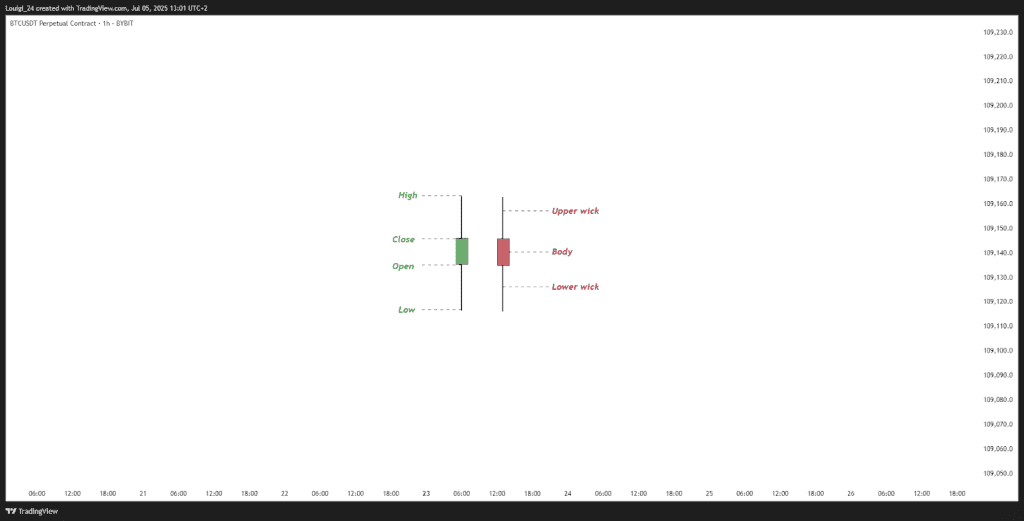
- Body, Wick (Shadow), and Tail
Each candle contains three core segments, that together convey the character of market movement:
- Body: It sits at the centre, as a rectangular block that denotes the range between the opening level and the final close.
- Wick: Extending vertically from the block are lines commonly referred to as shadows or wicks. The upper line records the session’s highest price, while the lower marks the lowest point touched within that stretch.
- Tail: These vertical lines together are sometimes called the tail. This full length reveals how far the price moved within the period, offering clues about volatility and intraday sentiment.
- White/Green Candlesticks
When a session ends with a higher close than where it began, a white or green candle is displayed. Depending on the charting tool, the colour may vary with white or green, but the message remains constant.
- Black/Red Candlesticks
A red or black formation signals that the closing value dipped below the initial trade level within the session. These colour choices, while dependent on platform settings, consistently denote contraction.
How to Read a Candlestick
The form & proportions of each candlestick show how trading activity took place within a specific window. Interpreting these bars can offer insight into underlying sentiment and change in momentum.
- A large filled body shows strong movement during the trading period. When displayed in green or white, it means steady buying interest. If shown in red or black, it often points to persistent selling throughout the day.
- A short filled body suggests limited range, where neither buyers nor sellers showed commitment. This often appears in phases of uncertainty or ahead of key announcements.
- A long upper wick means prices moved higher at some point but could not stay there. The late pullback hints at reluctance near higher levels.
- A long lower shadow, on the other hand, shows a dip that failed to hold. Recovery before closing may point to latent interest from buyers stepping in..
Reading these visual cues, especially in context with surrounding candles, allows observers to identify possible trend reversals or continuing patterns within the broader chart.
How to Analyse Candlestick Chart
Like noted above, evaluating a candlestick chart goes beyond observing isolated shapes. It involves recognising how movements develop across time, influenced by both recent activity and broader context.
- A group of consecutive candles leaning in the same direction may point to a developing trend rather than a momentary movement
- Alternating colours over several intervals can reflect hesitation or a shift in control between buyers and sellers
Position also matters. A green candle forming after a series of red ones near a previous low may signal potential reversal. Likewise, a strong red formation breaking below earlier support levels could reinforce a downward move.
The surrounding context, recent highs and lows, the length of previous bodies, and how the candles cluster, adds meaning to each formation. Interpretation strengthens when the chart is viewed as a whole.
Bullish & Bearish Candlesticks
Candlestick formations are typically classified into two distinct categories, each offering insight into the likely path of price action.
- Bullish patterns
- Bearish patterns
Each serves a distinct purpose in assessing shifts in sentiment. A bullish formation suggests the potential for upward direction, mostly following a period of decline or consolidation. These formations suggest buyers are beginning to regain control.
On the other hand, bearish structures tend to surface when upward traction shows signs of decline. They reflect increasing supply pressure and may precede a pullback or broader downturn in the market.
Types of candlestick pattern
There are 42 recognised candlestick patterns used in trading. All of which can be further broken into simple and complex patterns. Familiarity with key candlestick patterns can support timely decisions in changing conditions. Below are some that traders often watch for in different situations:
| Doji | Morning Star | Piercing Pattern |
| Hammer | Evening Star | Dark Cloud Cover |
| Inverted Hammer | Spinning Top | Three White Soldiers |
| Bullish Engulfing | Shooting Star | Three Black Crows |
| Bearish Engulfing | Hanging Man | Marubozu |
Examples of Bullish & Bearish Candlestick Patterns
Candlestick patterns often pinpoint how sentiment shifts before price responds. Some suggest a build-up in demand. Others point to reduced appetite for risk. Below are five formations from each side of the market narrative:
Bullish patterns
| Pattern Name | Type | Formation |
| Hammer | Bullish reversal | Appears after a decline with a small upper body and long lower shadow. |
| Piercing Pattern | Bullish reversal | Opens lower but closes above the midpoint of the previous red candle. |
| Bullish Engulfing | Bullish reversal | A green candle fully covers the prior red candle’s body. |
| Morning Star | Bullish reversal | Three-candle setup showing a shift from downward to upward pressure. |
| Three White Soldiers | Bullish continuation | Three strong green candles suggesting sustained upward movement. |
Bearish pattern
| Pattern Name | Type | Formation |
| Hanging Man | Bearish reversal | Small body at the top with a long lower wick, found after a rally. |
| Dark Cloud Cover | Bearish reversal | A red candle opens above the previous close and ends below its midpoint. |
| Bearish Engulfing | Bearish reversal | A red candle fully engulfs the body of the previous green candle. |
| Evening Star | Bearish reversal | Three-part formation signalling a potential downward turn. |
| Three Black Crows | Bearish continuation | Three consecutive red candles often linked with strong selling activity. |
Using Candlestick Charts in Technical Analysis
The readings become more informative when assessed alongside broader technical analysis. Viewing them within defined price regions and combining them with other methods offers a stronger perspective.
- Support & resistance: Candlestick formations near these levels often highlight where price may reverse or pause based on past market reactions
- Retracement ranges: Movements near well-known Fibonacci markers, such as 61.8% , can serve as a secondary layer of insight
- Liquidity concentration: Reactions near liquidity zones, where buy or sell orders are concentrated, can result in stronger follow-through
- Momentum indicators: Alignment with tools like RSI or MACD can tell about directional cues and reduce ambiguity
Applying Candlestick Patterns: Real-World Examples
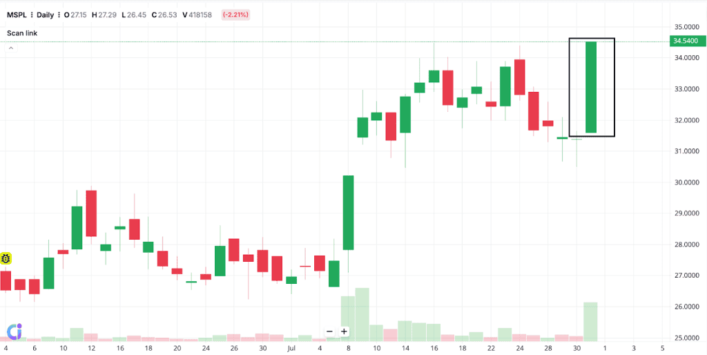
For example, let’s consider bullish and bearish versions of the Marabozu candlestick. It is a single candlestick with little to no shadows on either end.
In a bullish Marubozu, the session opens at the lowest price and finishes at the peak. This often appears during the early stages of an uptrend or right before a breakout. On 31st July, MSP Steel & Power Ltd showed this clearly. The candle had no visible upper or lower shadows.
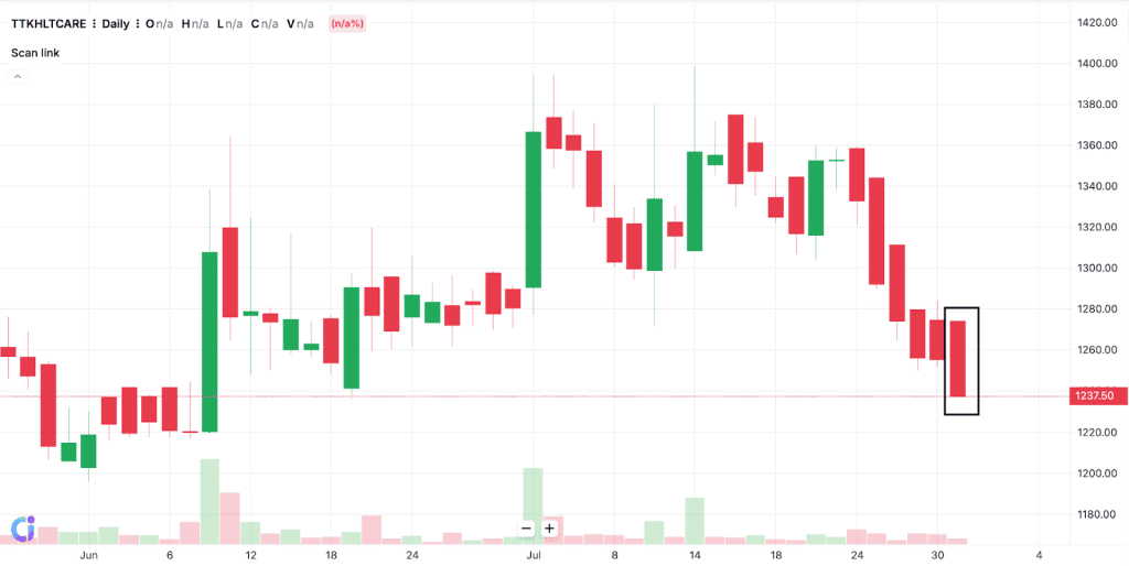
The bearish variation is its inverse. Price opens at the top and closes at the lowest mark. Such a shape often points to consistent selling without resistance. You can spot this on TTK Healthcare Ltd’s chart for the same date. Again, barely any wicks, just a solid downward move.
Advantages of Candlestick Charts
- The charts offer a quick visual indication of whether buyers or sellers influenced price during a given timeframe
- A single candle reflects opening, closing, highest and lowest exchange points, all within one compact structure
- Patterns such as reversals or continuations become easier to identify. Their structure allows traders to recognise potential turning points more quickly
- With less need to calculate or compare manually, traders can respond more quickly to developing conditions
Limitations of candle stickcharts
- Candlesticks tend to reflect short-term activity and may not offer clarity in broader market cycles
- Some patterns appear reliable but lead to misjudgement when not supported by additional data
- Chart-based reading often depends on individual perspective, leading to inconsistent conclusions
- A shape that implies strength in one asset class might carry little weight in another environment
Conclusion
Candlestick charting presents trading fluctuations in a format that helps clarify evolving price dynamics. Each structure reflects how market pressure shifts across a given range. When combined with broader market tools and interpreted with attention to context, they contribute to a more practical approach to reading financial movement.
FAQ
It helps traders observe how price moves within a selected timeframe. Each unit shows the open, high, low, and close. People use it to spot potential shifts in market behaviour. It can support short-term decisions or broader analysis. Some rely on it to interpret sentiment. Others combine it with indicators for added context.
Start by identifying the open and close positions. Look at the body to understand who held control during that period. Check the upper and lower wicks for signs of rejection or pressure. Compare candles across sessions to see if momentum builds or fades. Patterns may suggest hesitation, continuation or reversal.
What works well in one setting may not in another. Some prefer engulfing structures for their clarity. Others focus on setups like morning star or shooting star. Effectiveness often depends on context, not the pattern alone. Many look for confirmation before acting.
Traders often look for patterns that show strong reactions within a short window. A hammer or shooting star may highlight key turning points. Some watch for breakouts following narrow ranges. Others wait for confirmation through volume or trend alignment. What proves useful depends on timing, structure and surrounding price action.
Different approaches call for different formats. Some prefer candlesticks for their detail. Others lean on line or bar charts for simplicity. The choice often depends on how someone interprets movement. No single style suits every strategy or timeframe.
Each candlestick shows four prices: open, high, low, and close.
Green candle → Price closed higher (buying pressure).
Red candle → Price closed lower (selling pressure).
Body size → Strength of the move.
Wicks → Rejection of higher or lower prices.
Always read candles within the overall trend, not in isolation.
Candlestick patterns show the battle between buyers and sellers.
Large body = strong momentum.
Small body + long wicks = indecision.
Patterns near support/resistance are more reliable.
Wait for confirmation from the next candle or volume before acting.