In the Britain of the early 1960s, the economy moved with the caution of a recovery. Economic growth was fragile and markets were hesitant. The Episcopalian Church, with significant reserves, sought a way to nurture its assets while avoiding rash gambles.
Edwin Coppock was invited to advise. He approached the problem differently from traditional analysts. His focus was on the psychology of investors rather than on conventional valuation metrics.
A dialogue with church elders sparked an unusual analogy. They spoke of mourning after a personal loss and the quiet interlude before life resumes its rhythm. Coppock recognised a similar cadence in equity cycles after protracted downturns.
From this idea emerged a distinctive model, later named the Coppock Curve. It offered a systematic way to identify when pessimism was giving way to renewed optimism.
What follows will explain the operational mechanics of this measure and the ways in which it can guide decisions in long-term strategies.
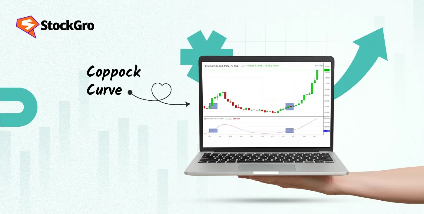
What is the Coppock Curve?
It is a momentum-based tool used to identify long-term buying opportunities in equity markets, particularly after extended declines. It was originally created for use with stock indexes and is less suitable for short-term or intraday trading.
Unlike tools aimed at day traders, it operates on monthly charts, offering signals less frequently but with broader implications. A rise from negative territory can point to a shift in sentiment. This indicator is generally favoured by portfolio managers tracking macro trends, helping to map possible recovery phases rather than short-lived market moves.
Who Developed the Coppock Curve?
Coppock Curve is the technical indicator formulated by Edwin Sedge Coppock, an economist with a thoughtful approach to financial cycles. Published in Barron’s in 1965, his work responded to a specific request from church boards managing portfolios over decades.
How Does the Coppock Curve Work?
Here is how it works:
- It measures the rate of change (ROC) in prices over two different timeframes (specifically over 14 and 11 months)
- These values are then added together
- A weighted moving average is applied to smooth the result ( 10 month WMA)
The outcome is a single plotted line that moves above or below a central axis.
Coppock Curve Formula
ROC for two periods:
The rate of change shows the percentage difference between the current price and its value over a past period. It is calculated as:
ROC = ((Current Price − Price N Periods Ago) / Price N Periods Ago) × 100
Two separate ROCs are calculated to reflect movement over different horizons.
Summing two ROC values:
This step combines the two ROCs into a single figure that captures a broader measure of momentum.
Composite ROC = ROC1 + ROC2
Apply a WMA to the Composite ROC:
To smooth fluctuations and highlight trend direction, the composite is passed through a weighted moving average:
WMA = Σ(Weight * ROC Value) / Σ(Weights)
Recent values are given more weight, ensuring the line reacts proportionally to market shifts without overreacting.
How to Calculate the Coppock Curve
In Indian market research, practitioners sometimes apply the indicator with indices like NIFTY 50 and BSE Sensex to gauge long term direction. The next section presents a step by step illustration using simulated index levels.
| Month | Price (₹) |
| 2 | 8000 |
| 3 | 8200 |
| 4 | 8400 |
| 5 | 8600 |
| 6 | 8800 |
| 7 | 9000 |
| 8 | 9200 |
| 9 | 9400 |
| 10 | 9600 |
| 11 | 9800 |
| 12 | 10000 |
| 13 | 10400 |
| 14 | 11000 |
| 15 | 12000 |
Step 1: Estimate the Long ROC
Let’s assume a 14-month period.
((12000 − 8000) / 8000) * 100 = 50
The rise is 50% over this span.
Step 2: Repeat the same calculation for Short ROC
Assuming 11-month period.
Short ROC = ((12000 − 8600) / 8600) * 100 = 39.53
₹8600 to ₹12000 shows an increase of 39.53%.
Step 3: Merge both readings for a combined measure
Composite ROC= 50 + 39.53 = 89.53
This combined value captures momentum from both longer and shorter trends
Step 4: Use a 10-period weighted moving average to refine the output
To reduce volatility.
Take the last 10 momentum readings.
Assume these for illustration:
WMA ≈ (76 + 78 + 80 + 82 + 83 + 85 + 86 + 87 + 88 + 89.53) / 10 = 83.55
The average comes to approximately 83.55. This figure becomes the Coppock reading for Month 15.
What does this value mean?
- When this curve moves upward after spending time below the baseline. It can point to early recovery in the broader trend. Here 83.55 sits well above that threshold
- If the curve begins to drop after peaking. It might suggest a slowdown. Still the indicator remains more effective for entry alignment than exit cues.
- Crossing the zero threshold from below carries significance. It often signals a return of positive sentiment. Especially when it follows a prolonged decline.
How to Use the Coppock Curve in Technical Analysis
Coppock curve in technical analysis relies on combining long-range price changes with a smoothing mechanism. While the method remains consistent, how the outcome is interpreted varies across different phases of the market cycle. Each pattern it produces carries its own weight.
Coppock Curve for Bullish Signals
A rise from below the central line often points to a turning phase. This change usually follows a lull or sustained drop. When the reading begins to climb steadily, it can reflect a return of confidence. For many, this shift aligns with early signs of structural recovery rather than short-lived enthusiasm.
Coppock Curve for Bearish Signals
If the line starts falling after reaching a high, it may suggest the pace of growth is slowing. It does not always mean a reversal. Often, it just shows that the earlier strength is fading. While not designed to predict tops, this drop can act as an early warning to stay alert.
Coppock Curve for Long-Term Investing
Because it filters out frequent fluctuations, the Coppock model supports allocation decisions anchored in longer perspectives. It helps bypass temporary noise, focusing instead on broader cues. Its slow-moving nature makes it suitable for portfolios with measured, long-view objectives.
Best Timeframes for the Coppock Curve
The indicator was originally structured around monthly data, making it suitable for those focusing on broad market phases rather than frequent chart movements. Some market participants adjust the timeframe to weekly views to track gradual turns without reacting to every fluctuation. This allows a closer reading without abandoning the long-horizon perspective entirely.
Applying the method to daily or shorter charts changes its nature entirely. While it may produce more entries, the quality of those signals can decline. The focus moves away from strategy and leans toward reaction.
Advantages of the Coppock Curve
- Designed to track pronounced recoveries after sustained declines, making it relevant for portfolio-building strategies
- A rising curve from sub-zero levels can indicate the end of a major downturn, helping investors time entries more effectively.
- Though derived from Rate of Change and Weighted Moving Average, its plotted shape remains lucid and unambiguous.
- Applied to benchmarks such as the Nifty 50 or S&P 500, it limits the impact of erratic price movements.
Limitations of the Coppock Curve
- The indicator focuses solely on buy signals, offering no direct method to determine when positions should be closed
- Built on monthly data and smoothed averages, it verifies a market bottom only after it has formed, often reducing early entry opportunities.
- It performs more consistently on broad indices. Applied to individual shares, it may deliver erratic or misleading readings.
- In cases of sharp rebounds, the signal can lag, meaning potential gains may be partially missed.
Coppock Curve vs Other Momentum Indicators
Momentum measures differ in their underlying logic, calculation, and suitability for various market conditions. The Coppock approach concentrates on long-term shifts, whereas many others react more quickly to short-term patterns.
Coppock Curve vs RSI
RSI evaluates the proportion of recent gains to losses on a defined scale, often signalling overbought or oversold phases in compact timeframes. In contrast, the Coppock Curve smooths data over months, focusing on primary market turns rather than temporary corrections.
Coppock Curve vs MACD
MACD interprets the gap between two exponential moving averages, generating signals whenever lines cross. Coppock, by contrast, triggers fewer alerts, typically aligning with broader changes in market direction rather than frequent tactical moves.
Coppock Curve vs Moving Average
A moving average smooths pricing over a fixed span, indicating shifts when values intersect with the average. The Curve integrates rate-of-change elements, yielding less frequent but more structural reversal signals.
Tips for Using the Coppock Curve Effectively
Placing this measure within a layered evaluation can heighten clarity in reading market transitions. Embedding it in a wider interpretative framework often increases its functional weight.
- Coupling it with RSI, MACD, or other indicators can corroborate findings and curb responses to deceptive patterns.
- When its slope diverges from actual price behaviour, the signal may hint at fading propulsion or a shift in collective mood.
- Conventional rate-of-change periods and weighted averages may not suit every context. Calibrating these intervals can improve alignment with the tempo of a given index or asset class.
Common Mistakes with the Coppock Curve
- Applying this measure to short-duration trades often produces distorted outcomes, as it is calibrated for broader market cycles.
- A further pitfall is interpreting values without reference to macroeconomic conditions, sectoral dynamics, or corroborating technical evidence. Such omission can skew the reading and impair decision-making.
- Using it during non-directional or highly erratic phases can also mislead. In these conditions, validation through additional analytical tools becomes critical before allocating capital.
Coppock Vs Other Momentum Indicators
The Coppock Curve is a long-term momentum indicator mainly used to identify major market bottoms. It is smoother and slower compared to many popular trading indicators, making it more suitable for long-term investors rather than short-term traders.
Here’s how it compares with other momentum indicators:
- Coppock Curve – Best for spotting long-term buying opportunities after deep corrections. It focuses on trend reversals rather than frequent signals.
- MACD – Faster and more widely used for short- to medium-term trend changes. Provides crossover signals and momentum shifts.
- Ease Of Movement (EOM) – Measures the relationship between price change and volume. Useful for identifying how easily price moves in a particular direction.
- Super Trend Indicator – A trend-following indicator based on volatility. It gives clear buy and sell signals and is popular among intraday and swing traders.
In short, Coppock is slow and strategic, MACD is versatile and responsive, EOM combines price with volume efficiency, and Super Trend is practical for directional trading.
MACD Indicator
The Moving Average Convergence Divergence (MACD) measures the relationship between two exponential moving averages.
It consists of:
- MACD line
- Signal line
- Histogram
Buy signals occur when the MACD line crosses above the signal line, and sell signals occur when it crosses below.
MACD is widely used to detect momentum shifts and trend reversals.
Ease Of Movement Indicator
The Ease of Movement (EOM) indicator shows how easily price moves based on volume and price change.
- Positive values indicate upward movement with low resistance.
- Negative values indicate downward movement.
It helps traders understand whether price movement is supported by strong volume or facing resistance.
Super Trend Indicator
The Super Trend indicator is based on average true range (ATR) and price action.
- When price is above the Super Trend line → bullish signal.
- When price falls below → bearish signal.
It is simple, visual and commonly used for intraday and swing trading.
FAQs
The indicator offers a way to gauge when protracted weakness may be change toward renewed strength. Traders and portfolio managers monitor its movements for early signs of optimism returning. The method often focuses on broad indices, not single stocks. Its readings can help frame decisions for those with multi-year horizons. Some see it as a way to keep emotion in check during turbulent periods.
It was conceived to capture changes that evolve over larger cycles. The calculation relies on monthly data, so it reacts slowly to rapid intraday changes. Fast-moving conditions may produce no meaningful signal within such a short timeframe. Traders focusing on daily charts often choose tools built for high-frequency analysis instead.
IIts historical performance has shown mixed outcomes. Some practitioners treat it as a useful compass for spotting early trend reversals. Others note that false signals can occur during volatile phases. Confidence in its output often rises when combined with other methodologies. Patience is usually required before its indications play out.
Many practitioners follow the configuration first proposed by its creator. This often involves 14- and 11-month rate-of-change inputs to smooth fluctuations. Some adapt these to match the volatility or rhythm of a specific market. Backtesting is used to judge whether changes improve effectiveness. Preferences can differ widely depending on asset class and timeframe.
It was developed by Edwin Coppock, an American economist and market analyst. It debuted in the early 1960s during his advisory work for the Church. His methodology leaned on behavioural insight rather than purely statistical models. Inspiration came from dialogues on the human process of recovery after bereavement. Over time, it became a recognised tool in long-horizon market analysis.
It can be applied to crypto in the same way it is used for other markets. The formula remains the same, but the data source would be crypto price history. High volatility in this space may lead to more frequent false signals. Some traders adjust the periods to better fit the faster cycles often seen in cryptocurrencies.
The Coppock Curve is a long-term momentum indicator designed to identify major buying opportunities after market declines. It is mainly used on monthly charts.
Edwin Coppock was an economist who developed the Coppock Curve in 1962 to help investors identify long-term market bottoms.
Traders typically look for a buy signal when the Coppock Curve turns upward from negative territory. It is mainly used for long-term entry signals rather than short-term trades.
The Coppock Breadth Indicator is a variation that applies Coppock calculations to market breadth data, such as advancing and declining stocks, to measure broader market momentum.