
Think about the last time you entered a trade and watched the price move exactly as you hoped. That feeling comes from reading the market correctly. Chart patterns give you that reading ability. When traders recognise these formations early, they gain an edge in timing their entries, protecting their capital, and maximising profits. This article will show you how to spot these setups and apply them in your trading strategy.
What Chart Patterns Mean in Swing Trading
Price movements on charts create shapes. These shapes reveal what market participants are thinking and doing. A stock might climb steadily, then pause, then surge again. That pause creates a pattern which tells whether buyers are gaining strength or sellers are taking control.
Markets move in cycles of fear and greed. When these emotions play out at similar price levels, recognisable formations appear. The reliability of these patterns is what makes them worth understanding and using for swing trading.
Why Chart Patterns Matter for Swing Traders
Swing trading patterns provide tangible benefits that directly impact trading outcomes. Understanding these advantages helps explain why traders rely on them.
- Timing Entry and Exit Points
Knowing where to enter saves you from chasing prices. Patterns provide specific trigger points where probability tilts in your favour. This precision prevents premature entries and late exits. - Managing Risk Effectively
Every pattern has boundaries. These boundaries tell you exactly where your assumption is wrong. You can calculate potential loss before risking a single rupee. - Identifying Trend Direction
Some patterns signal continuation. Others warn of a reversal. Understanding which is which keeps you aligned with the dominant force in the market. - Building Trading Confidence
Random entries create anxiety. Pattern-based entries create structure. Structure eliminates second-guessing and builds the discipline needed for consistent results.
Most Common Bullish Chart Patterns
Bullish patterns are formed when buying pressure is prevalent in the market. They indicate that the prices are likely to climb higher in upcoming sessions.
Cup and Handle
Cup and handle pattern, the prices first decline, rounding out at the bottom, before they recover to previous highs. Then there is a slight pullback before the price breaks out. This results in a formation that resembles a teacup with a handle on the right side.
Example: Coal India formed a cup and handle in early 2026. The cup base is near ₹410, and the handle is consolidating around ₹443, eyeing a breakout above ₹470.
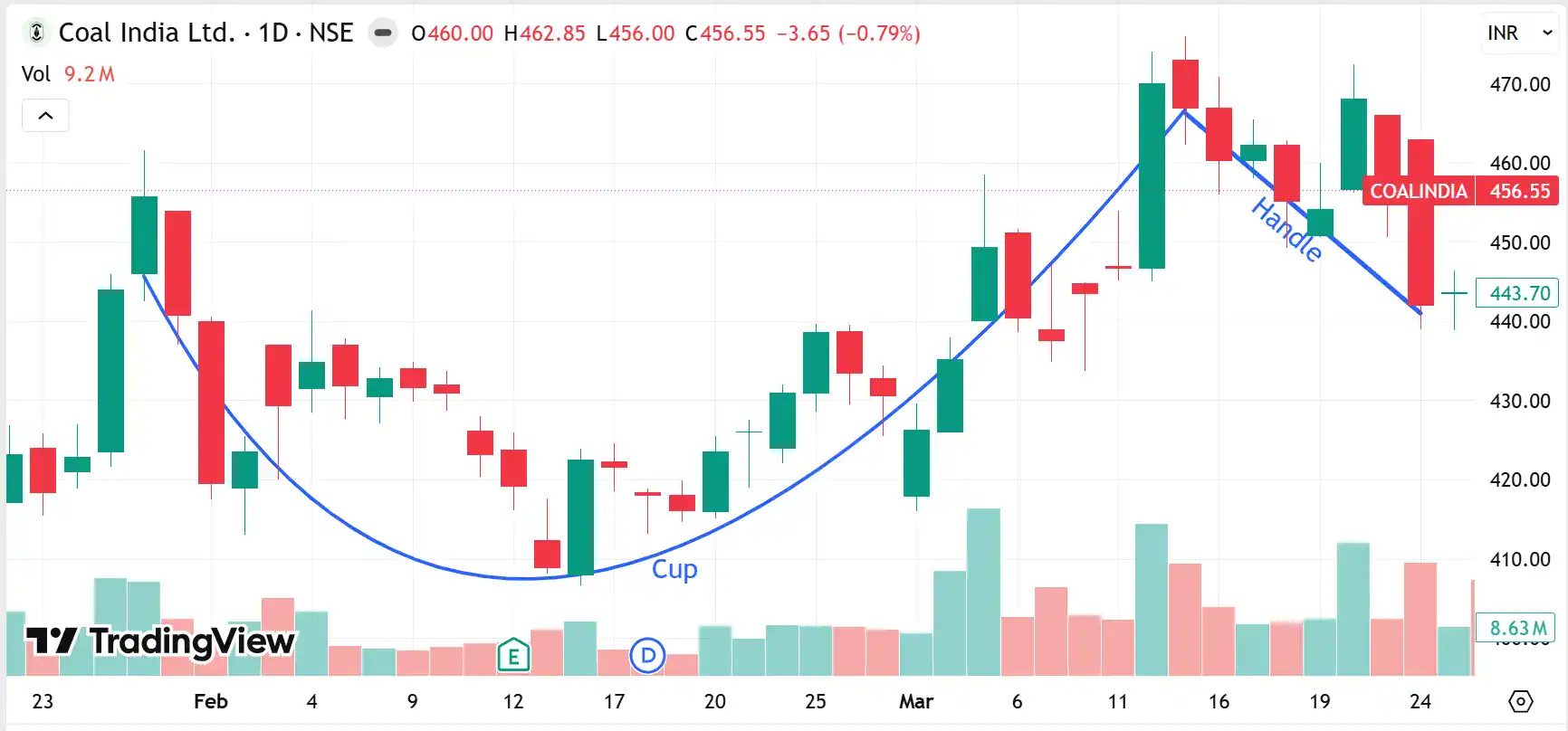
Daily candlestick chart of Coal India Ltd on NSE showing a cup and handle pattern
Ascending Triangle
In an ascending triangle, the price keeps making higher lows while repeatedly testing the resistance level. Each bounce back is higher, which creates an upward-sloping support line. The flat resistance at the top shows sellers defending a specific price.
Example: An ascending triangle pattern appeared in LIC India’s chart from August to November 2025. The flat resistance is ₹925, and the support line has risen from around ₹845 to over ₹890.
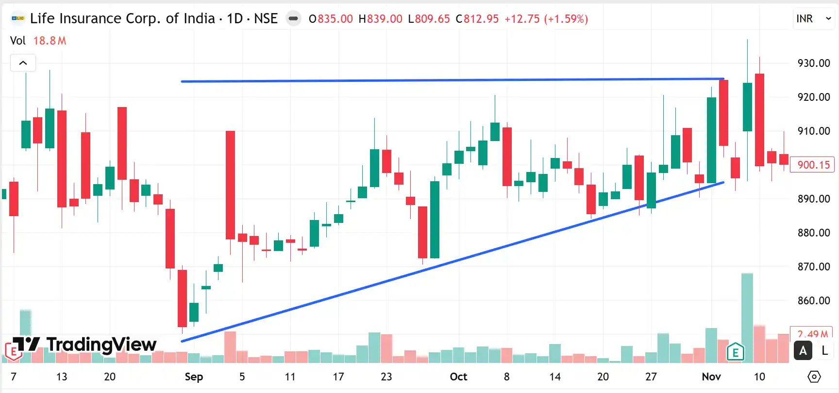
Daily chart of LIC India showing an ascending triangle formation
Double Bottom
The double bottom pattern creates a W shape on the chart. Prices fall to a support level, bounce up, fall back to approximately the same level, then rally strongly. The key is that both bottoms occur at almost equal depths.
Example: Hyundai Motor India made a double bottom formation from December 2025 to January 2026. Both the lows were near support at ₹2,255. A sharp breakout above ₹2,320 confirmed the reversal.
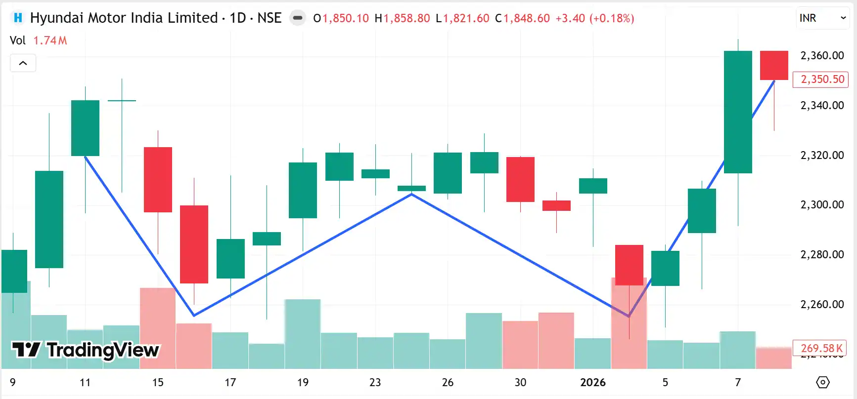
The Hyundai Motor India daily chart shows a double bottom pattern
Most Common Bearish Chart Patterns
Bearish patterns warn of upcoming weakness. They form when selling pressure begins dominating and suggest prices will likely fall.
Head and Shoulders
The head and shoulders pattern has three peaks. The middle peak or the head is the highest. The two outer peaks or the shoulders sit at roughly equal heights. A neckline connects the lows between these peaks. This formation signals exhaustion of the uptrend.
Example: Reliance Industries exhibited this pattern from April to May 2026. The left shoulder is near ₹1,378, the head peaks around ₹1,460, and the right shoulder sits near ₹1,380.
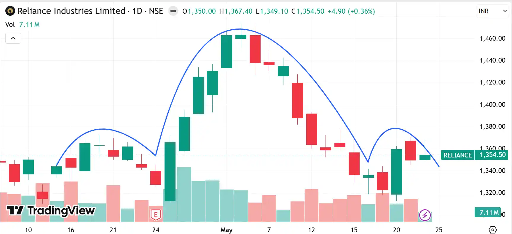
Reliance Industries chart showing a head and shoulders pattern
Descending Triangle
The descending triangle pattern has a flat support line at the bottom with falling resistance above. This formation signals that sellers are taking control at lower prices while buyers are defending a certain support level.
Example: Yes Bank made a descending triangle formation from October to December 2025. The flat support holds near ₹22.00 and progressively lower highs dropping from ₹24.00 to ₹22.50 before a breakdown.
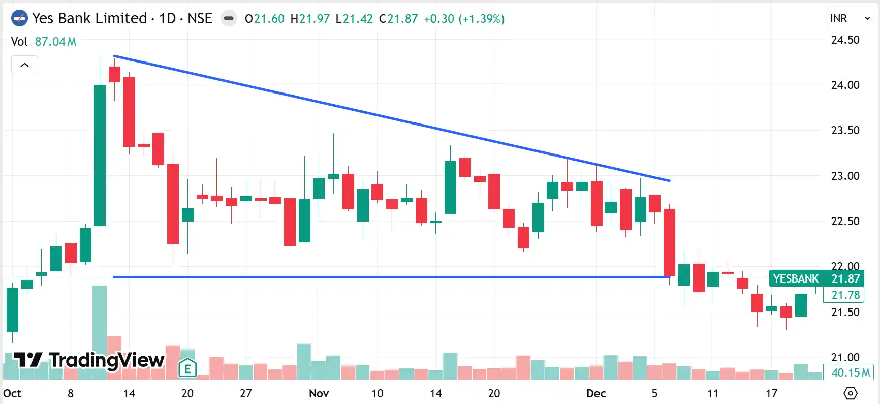
Daily chart of Yes Bank showing a descending triangle
Double Top
The double top looks like the letter M on a chart. Prices rise to a resistance level, pull back, rally to approximately the same level, then decline sharply.
ITC displayed this formation in January and February 2025. The twin peaks were near ₹463 in January and February 2025, with neckline breakdown below ₹430 confirmed in mid-February 2025.
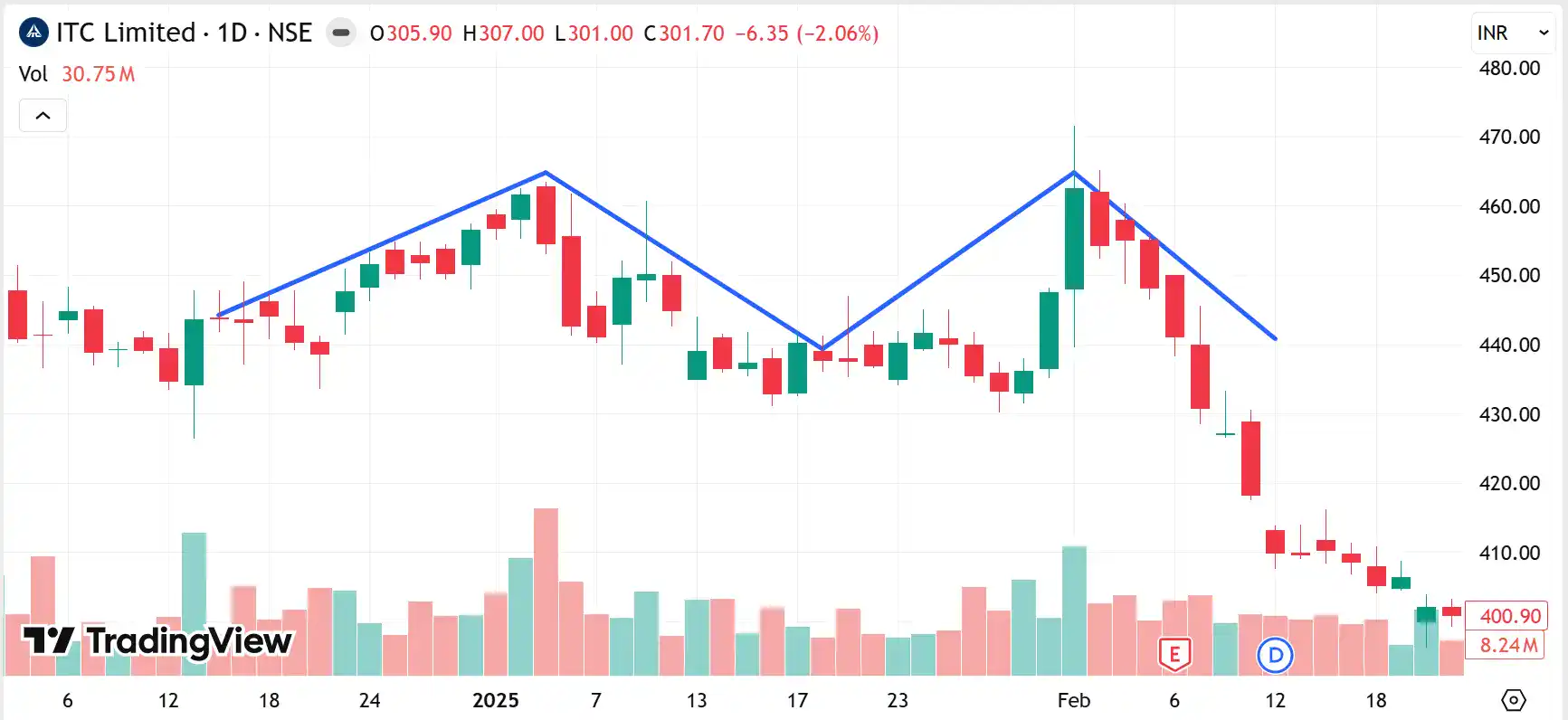
ITC is making a double top on its daily chart
How Swing Traders Use Chart Patterns
Spotting swing trading patterns is only half the work. Using them correctly separates profitable trades from wasted opportunities. Here’s how traders turn recognition into results:
- Confirming with Volume
Breakouts need volume validation. When a stock breaks resistance with high volume, the move has conviction. Breakouts on light volume are not sustainable and often reverse within days. - Combining Multiple Patterns
Many traders like to check multiple timeframes. A pattern on the daily chart becomes more compelling when the weekly chart shows similar movement. Alignment across timeframes increases the probability significantly. - Setting Profit Targets
Patterns provide measurement tools. Measure the height from the lowest point to the breakout level. Project that distance upward from the breakout point. This gives you a target based on historical pattern behaviour. - Placing Stop Losses
Each pattern has a logical place to set your stop loss, usually just beyond the pattern boundaries. This keeps your risk defined and limited if the pattern fails.
Timeframes Best for Chart Patterns
Your timeframe choice shapes everything from entry and exit to pattern reliability. Some amplify genuine signals and filter out noise, while others create false patterns that disappear quickly.
- Daily Charts for Core Analysis
Most swing traders live on daily charts. This timeframe filters out intraday noise while providing enough detail to spot formations clearly. Patterns here represent shifts in supply and demand dynamics. - Weekly Charts for Trend Context
A bullish pattern on the daily chart carries more weight when the weekly structure supports upside. Patterns on weekly charts tend to produce larger moves because they reflect a stronger consensus. - Four-Hour Charts for Timing
Four-hour charts bridge daily analysis with tactical execution. You can watch a pattern complete on the daily chart, then use the four-hour chart to time your exact entry as momentum builds. - Avoiding Very Short Timeframes
Timeframes below one hour generate false signals constantly. These work for day traders but create whipsaws for swing trading positions. Stick to four hours or above for reliable pattern recognition.
Common Mistakes Traders Make
The patterns work. The mistakes happen in how traders apply them. These errors appear repeatedly across all experience levels.
- Trading Without Volume Confirmation
A breakout without volume is like thunder without lightning. It makes noise but lacks power. Always demand volume confirmation before entering. - Ignoring Overall Market Trend
Bullish patterns in bearish markets will fail more often. Check the broader direction before taking individual stock patterns. Trading against the market can deplete your capital quickly. - Setting Stops Too Tight
Patterns need room to breathe. Stops placed too close get hit by normal volatility before the pattern can play out. Use pattern structure to set stops, not arbitrary percentages. - Forcing Patterns That Are Not There
Your brain wants to see patterns everywhere. Resist this urge. Not every price wiggle is tradable. Maintain strict identification criteria and wait for clear setups.
Final Takeaway for Traders
Patterns work because market psychology repeats. These formations appear across all stocks and timeframes. Master a few of them before expanding your pattern library. During pattern recognition, combine the formation with volume analysis and stick to your stop loss. With practice, spotting opportunities with these patterns will become instinctive.
FAQs
There is no single best pattern. Traders commonly prefer cup and handle, triangles, double bottoms, and head and shoulders based on market conditions.
Chart patterns help traders identify possible price movements and trading opportunities. Still, confirmation signals and disciplined risk management remain equally important.
Daily charts are commonly preferred for swing trading because they balance clarity and reliability while reducing short-term market noise and false signals.
Yes, beginners can use chart patterns by first learning a few basic setups, understanding confirmations, and practising disciplined risk management before trading actively.
No, chart patterns do not guarantee profit. They only indicate probabilities, which is why traders use stop losses and confirmation signals carefully.